Kia Telluride
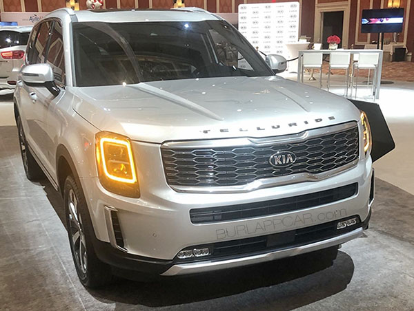
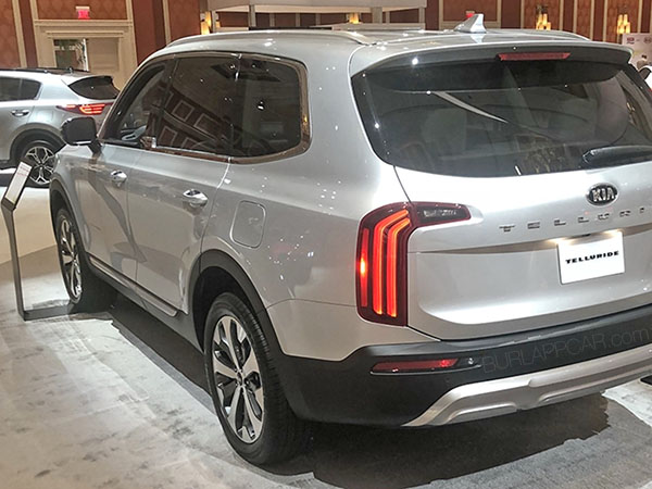
Looks like the full-size telluride is ready to go.
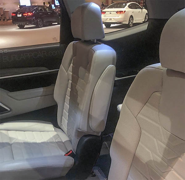
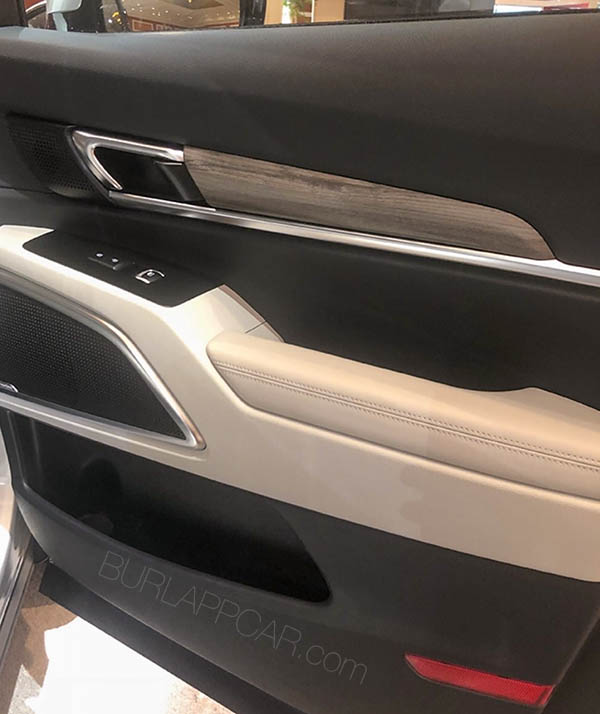
(As seen in these pictures from a dealer meeting)
This is basically the same car as the new Hyundai Palisade. Except it does look a lot better in my opinion.
Sure, the overall design is more mainstream, but the garish grille is gone.
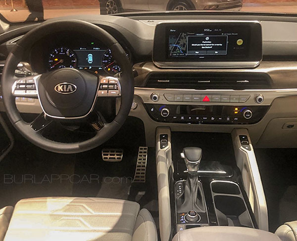
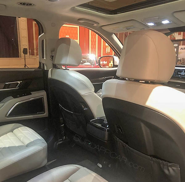
The interior seems pretty classy and upscale as well. With nice design touches here and there.
Of course, unlike the new Lincoln Aviator, I have not seen the Telluride in person.
But this already looks like a much nicer interior to me. (Satin finish is always nicer looking and more upscale than full-on chrome everywhere.)
And yes, this still has that tablet stuck on top of the dash. But for some reason, it looks better than in the Lincoln. Maybe just because it is wider. Who knows…
This could turn out to be quite a classy ride…
(Thanks to a reader, George Werner, for sending me these pictures)

