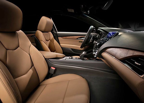
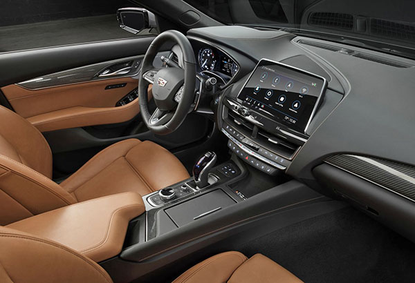
2020 Cadillac CT5 Interior
Last Updated:
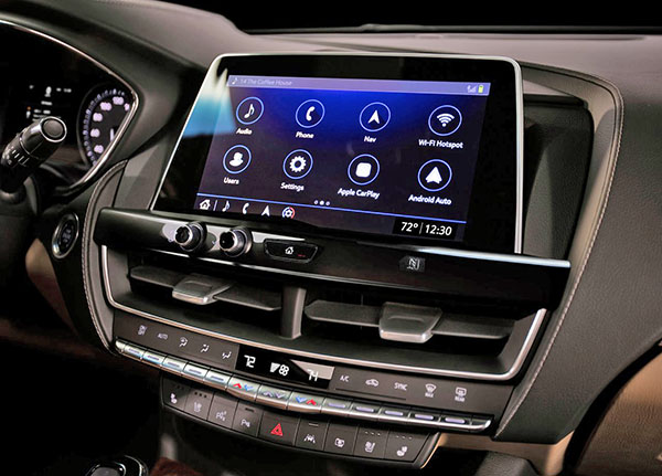
GM had released a few pictures of the new 200 Cadillac CT5 a while ago. But almost nothing of its interior.
Today we can finally see it. And it’s fine.
It seems like a blend of every other current Cadillac models. But I have to say, I was expecting more.
Current Cadillac interiors are fine, but they don’t exceed any expectations. Like a true Cadillac should.
You never sit inside and sit there for a few seconds, amazed.
As you should.
Sure, this is not as busy (or even vulgar) as a BMW interior.
But this is not very inspiring either.
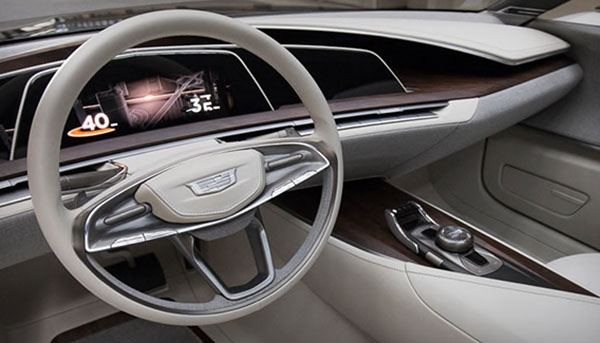
The worst part of it is that Cadillac does have wonderful designers that can actually come up with amazing interiors. Like the ones above from the Elmiraj and Escala concepts.
These came out years ago.
And none of Cadillac’s current interiors resemble them in any way.
Such miss opportunities of one of the greatest name in the business…
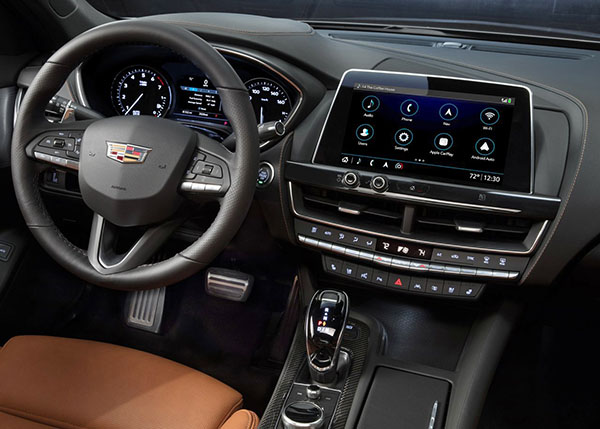
I can't believe they don't have a full digital instrument cluster.
Cheesy interior. The whole thing looks to me like a glorified Chevy Malibu. I like the addition of Super Cruise, but it sucks that Caddy jumped on the cheap-looking tablet thing that looks like a total afterthought. No thank you.
It's interesting that now that everyone is doing the tablet look they copied from BMW, BMW is building the display back into the dash.
The stitched wheel should be standard–it's the first thing a customer sees inside! If it has to be vinyl, it needs to look more like leather and less like a golf ball.
The right side wood panel is too small compared to the large black patch above it. Looks too much like a mongoloid eyelid. Might look better when seated.
Don't get me started on the dominance of black.
The two knobs, volume and the other one, are horribly placed. One will get confused for the other CONSTANTLY.
This new CT5 is suppose to take on theBMW 3 series! Wow! Cadillac missed the entire car market with this new CT5!
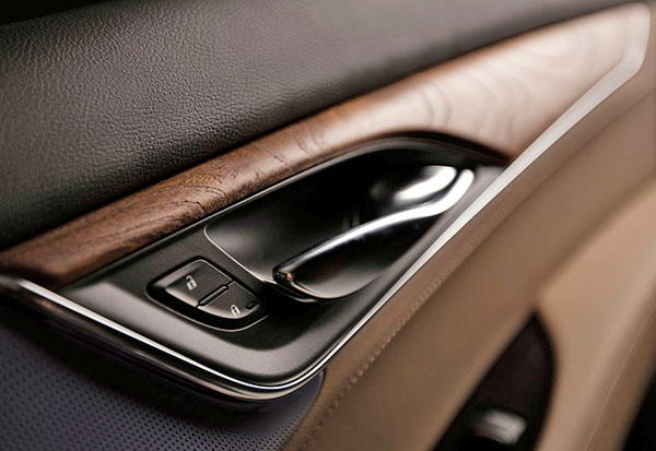
It's always the switchgear that hurts Cadillac (particularly on the doors). Why can't Cadillac create their own distinctive controls that look different from Chevrolet?
Some may find the interior boring. Boring is GOOD. People don’t like the touch screens and hepatic feed back…people like buttons and knobs. People like nostalgia. The exterior I feel is the disappointment. Could have been simpler and more coherent.
The two knobs, volume and the other one, are horribly placed. One will get confused for the other CONSTANTLY.
That will only be a problem for renters, but the insult to symmetry is painful.
I've read 3rd or 4th hand that the angle of the tablet can be adjusted.
As long as American customers want buttons on the dashboard ,then you are stuck with buttons.I
n saying that, yes its a shame Cadillac cant compete with even Lincoln when it comes to interiors. It does not look very premium