More 2020 Honda Fit illustrations.
Last Updated:
I think these look pretty horrible.
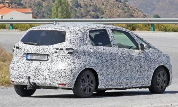
But unfortunately, they seem to be pretty close to the prototypes we have seen driving around.
Although the prototypes do not show these weird bulging fender shapes around the wheels.
And the C-pillar is still a mystery.
I do have high hopes for the new Fit.
Overseas, it will be offered as a regular hatchback, or a raised version similar to what Subaru and have been doing.
Which could be cute on the small Honda.
But especially, Europe will be getting a Hybrid version. Which should really be offered in the US.
As recent Hybrids from Honda have been pretty fantastic cars.
I really think a 55/60MPG Fit would work here very well…
I can't say i'm disappointed. The Fit was never much of a looker anyways, so my expectations were lower than dinosaur bones…
Honda just can't let go of the Acura-like shield nose. Too bad. Acura learned it doesn't help.
When is the last time Honda made an attractive car?
It looks like they are trying to evolve toward that round headlight face concept car and the Honda E. Incremental changes over time to get there.
I would imagine the light halo completely circling the head light down the road. From there, they make it round.
Bulged fenders should give a better balance as it pushes the mass inside of the wheels. The C pillar in the rendering looks "Meh". But there's only so much you can do with such a small canvas.
Hey– the 2004 Suzuki Aerio SX has risen from the dead.
The auto equivalent of "Jake from StateFarm," that thing is hideous.
"Bulged fenders should give a better balance as it pushes the mass inside of the wheels."
I love when people who don't understand anything about car design try to sound knowledgeable about the subject. It's just precious.
These sketches were clearly made starting from the photos of the camo prototype. But the designer has invented badly. The reality will be much more pleasant
Why? People and stuff don't scale down to the size of the car. Heavy stuff pushed to edges is not a plus. Those are also not very wide tires.
If I load my CUV with concrete patio slabs which I have done and don't move them inside the perimeter of the wheels as much as possible I can feel that concrete a lot more than when moved further inwards. Did that a month ago 2 trips. 1st trip handled like a pig. 2nd trip handled sluggish but much improved because I pushed it inwards towards the middle.
According to you genius, the car should be perfectly capable of handling properly if the wheels were spread out the width of the roof with the floor the same width shown and roof was the width of the floor shown. Clown. I suppose that the wheels pushed as far as possible to the front and back are just for show and not for stability.
I suppose you could drive in a downpour with the windows down that way because of the overhang.
There's a web site called slashdot.org People can use a logged in name or post anonymously. If you post anonymously your post is from "Anonymous Coward".
I hope that rear-quarter illustration is way off, because all I see is 2007 Mercedes B-class.. even the fender bulges look like the ugly W221 S-class. Way to make the 4th generation Fit look older than the 1st.
Cesare monteri is absolutely correct. This is some Asian artists take on what it will look like based on the camo pics. He's got bits and pieces right but the way his whole looks is off. Has to be. Let's hope for Honda's sake its off.
NEXT STORY.