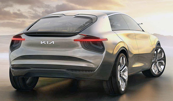
Kia trademarks new logo.
Last Updated:
Kia just trademarked a new logo in Korea. And it looks very similar to the one used in the recent Imagine EV concept.
I think it looks great. Kia really needs to step away from the current logo. Dating back to a time where their cars were, let’s say, “less than great”…
Although there is a rumor about the new logo only being used on their electric models, I hope it does spread quickly to the whole line up.
What do you think of this new Kia logo?
And who else do you think should redesign their logo to something more current and modern?
It's illegible. The black and white image can't be easily understood as "Kia." The horizontal lines connecting the letters are too thick. In the photo, the chrome lettering is easier to read.
Looks Awesome!
This is under way while Chevrolet is stuck with its golden, low taste logo….
Exactly what they need right now. I love it.
Much needed change
The new Kia logo looks awesome! It needed some serious updating!
KIA should adopt the new logo, but drop the lines connecting the individual letters. Personally, I think both Chevy and Ford need to update theirs, especially Chevy.
Totally agree about Chevy.
It was a hell of a smart move to hire Audi designers and MBW M division engineers. These Koreans have figured it out, although a relatively new company.
Ok.
The logo on the concept car looks much better.
I think it looks great. Kia has really stepped up the game in terms of design and even performance with the Stinger. I can't wait to see what the new Optima looks like, and hopefully it will have this badge.
The logo is the least of their problem. Their main problem is the have to much crossover between Hyundai/Kia/Genesis. You have Kis's that are more expensive the their sister cars at Hyundai and Genesis having uglier cars than Hyundai. Kia should be the low end. Cheap, sporty young people cars. Hyundai should be the mid teir volume ICE leader appliance division. And the Genesis should be all luxury electrics with a prestige halo car like a Genesis sports coupe.
It drives me crazy that the bottom left corner of the K is sharp but the upper right corner of the A is rounded… throws the whole balance off! And I agree that the connecting lines on both ends of the I should be about half as thick as they are. Frankly, an amateur effort from a design standpoint.
I hope this is for all models not just EV.
The logo on the concept car is the same logo in the article…
Respectfully disagree! KIA should not maintain the cheap value car but rather stay the course. KIA is doing a fantastic job! I love my Stinger GT and it is by no means a cheap version of Hyundai or Genesis.