2021 Kia Optima first official pictures
Last Updated:
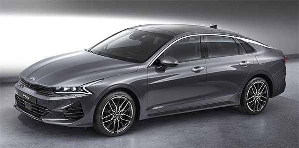
I think this is looking just fine, and quite modern.
The weird side crease that could be seen in one of the illustration teasers is nowhere to be found. Which is good.
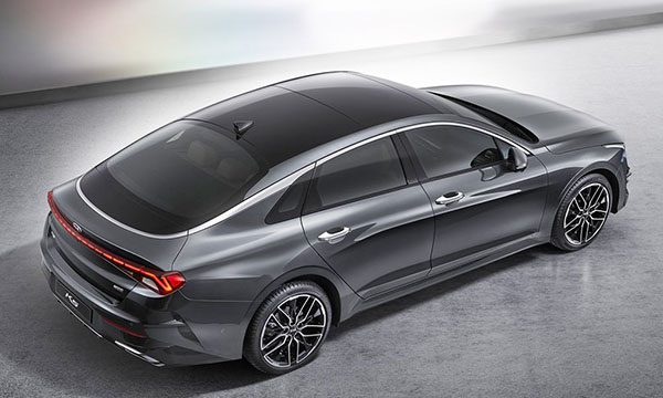
But the small trunk opening on such an obvious fastback design is a disappointment. And almost weird.
Why such effort to NOT have a hatchback opening when it is actually designed for one.
This is quite a strange choice. maybe this is a last minute decision, after the main design was locked?
Usually, you see the opposite. Some hatchback designs who try to look like a regular trunk (Like the new Skoda Octavia in Europe.)
But this is a strange trend of new sedan designs that obviously look like hatchbacks but are not (Like the Honda Accord and many more…)
Just like the Honda Accord, has a trunk too! Bad design to “truncate” the utilization for expanded cargo capacity! No buy for me because of it not a liftback that would bring both sedan and SUU into one vehicle.
This looks amazing, but like you Vince, I condemn the blown opportunity of making this a sportback. If the powertrain options follow the Sonata, I will wait and see what the GT is equiped with when introduced. I am glad it didn't utilize the same drls as the Sonata. The front end styling alone make it more attractive compared to the Sonata.
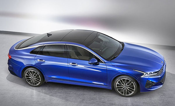
Kia's execution of a floating roof seperated by that elegant chrome strip that now wraps around the rear window's lower edge is much better than Nissan's on the Altima.
GM started this faux-hatchback theme in 1977 with the Buick Century and Oldsmobile Cutlass Salon, and it didn't sell. Because it was stupid, period. But we're kind of nostalgic, here, in North America, even for stupidity… When will the Vega and the Pinto come back?
I like the wraparound chrome strip, but the body color/black demarcations may not work well IRL. It might be even swoopier without the third side window, which is all but useless, as on most sedans.
The GM cars in the 70's were basically following a European trend. The Citroen GS and CX, among others, were fastback designs with actually small trunk openings (that changed later on the GSA though…)
But GM did uses a proper hatch on the smaller Citation. And even later, the Corsica did get a true hatchback version.
The decision to use a trunk instead of a hatchback is primarily based on structural optimization. The fact they ended up with a blacked out portion of the trunk lid with the chrome strip across the border of the color change, means that there was probably a significant argument between the marketing and engineering departments with the designers with their heads in their hands….
There is an awkward form transition in that rear pillar at the upper corners of the window… I'm sorry, but that looks like an error, to me…
My "inner jury" is still out on that front corner light design. Is it cool, or is it just busy? Kinda reminds me of some of the 60s concept car forms, if fused with Tron influence.
I'm looking forward to studying this one at the LA Autoshow
I don't get all the fuss seeming to claim that the designers duped the public into believing it to be a hatchback. A Car is merely a shape spliced by artistically-functional part lines and graphics. The "mainstream sedan" caved to this "4-door coupe" look some time ago, likely beginning with the Fusion or Civic.
Agree with the previous comment, Vince you need to get over the sedans that look like hatches issues. The long-booted sedan is a thing of the past now, all non-wagon bodyshapes are moving towards long rear window/short decklid for both aerodynamic and aesthetic reasons. As for the rest of the car, I like the details but not the proportions underneath – the rear in particular looks really squished and boxy, completely at odds with the taillight bar which rather than adding a sense of width just looks uncomfortable.
I love to see the reach Hyundai-Kia are exhibiting. I believe they're the only company pushing styling boundaries at the moment, unafraid to take some risks. (I would have said that about Lexus at the first appearance of their Klingon-vajeen look but it's getting old at this point. The Koreans seem fearless and will certainly dump this for another over-the-top shape-and-line-fest in the next iteration.
I hereby predict that the Sonata and Optima will convince precisely no-one to switch to a car from an SUV. I hereby further predict that neither will attract much attention on the road. Heed my words: Car-nak has spoken!
I like it overall except for the fact it's not a lift back like the Stinger, Arteon and the Regal. Huge missed opportunity.
But it's a good looking sedan.
The Audi designers of Hyundai rock. One more eye candy on the road. Who would have known 10 years ago?
What it looks like is there is a line and the blacked out lower portion of the glass actually lifts with the trunk lid for a larger opening. Now will it be glass or a cheaper looking plastic that is that piece. My guess would be plastic for weight and to avoid cracking with hard closes.
That trunk design is similar the the Lincoln MKZ, which also has black trim on the trunk to make the rear window look bigger
Rear quarter window looks wrong, previous two models seemed to integrate the window into the chrome strip properly but this looks like it is crowding into the strip instead. Disappointing but still better looking than most midsized sedans on the road.