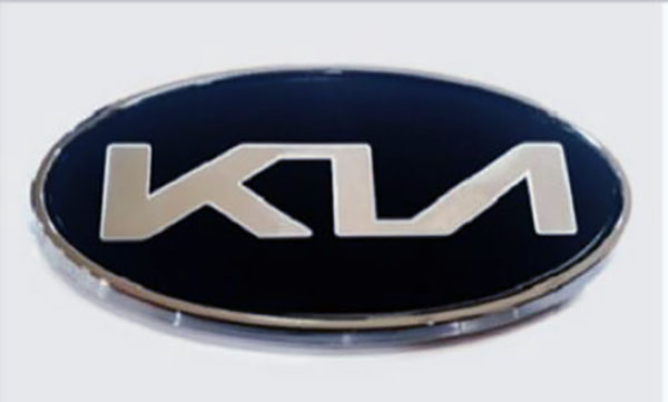
New KIA logo.
Last Updated:
I have to say, that it looks more like KLA to me than KIA.
I guess it is good for Kia to get a new logo since their products are so different. And so much better than just a few years ago.
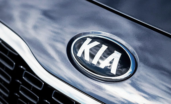
I have to admit I never really noticed the current Kia logo, so here it is.
Sure, not as cool as the new one. But the “i” is more obvious.
What do you think?
It would look better by removing the oval or made it more rectangular
How about just spelling it out in Korean
"기아자동차" and be done with it?
I wouldn't recognize the Korean and I certainly have no idea what those lines in this logo redesign mean. It's one thing to come up with a word or symbol, but if you are going to do a word, the word should be readable.
I don't think it will move the needle for them one way or the other. Smells of desperation more than anything else, like they've plateaued and can't come up with anything else.
Would prefer the single letter K that has been doing the rounds.
A logo is a symbol that brings the product to mind. If it suggests "Kia" when you see it, it isn't critical that the "I" is clearly articulated. The design is relating the slant of the K to the slant of the A and contrasting that with the vertical I. It's a design, not text.
The Koreans are making the established "luxury" brands less relevant. In 10 years we will not be able to tell the difference, as they will be getting more acceptance from the younger generations.
Clearly the designer's first language isn't English. All I can see is KU.
Why don't they use this alternate logo they already have? You see it on Kias every so often.
https://i.redd.it/w8a3zj0cstn01.png
I like it, it's more in line with their image
Haha….some of the comments here are precious. Logos are not to read people. Come on. First timers?
That logo is bad and doesn't quickly let you know what it is saying, so just bad design all around.
This logo is an improvement and tasteful at that. Given good looking designs, good driving dynamics, and great value, the logo will be icing on the cake for a brand that is on an upswing. For those who are are logo-challenged, can they read the Chevrolet logo?