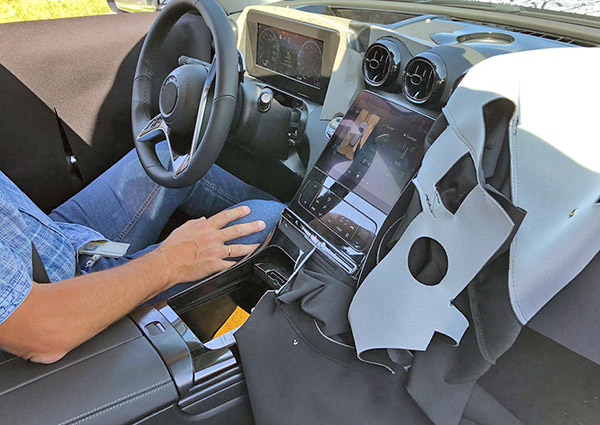
2021 Mercedes C-Class interior
Last Updated:
It basically will look like a smaller, cheaper 2021 S-Class interior.
“All screens all the time”
The thick plastic frame around the speedometer screen looks really bad and cheap. But that could just be on this prototype.
Now the round vents also look really odd on top of that screen.
Otherwise, things look pretty modern. But it also means that all of their interiors might end up looking the same (This being so close to the next S-Class interior design)
Just like what thrive been doing with their exteriors. At least on all their sedans.
Which is really too bad…
I wonder about the recess behind the gauge screen (under the windshield). Doesn't look like HUD. More warning lights?
those climate controls look CHEEEEEAAAAAAAPPPPPP
I seriously doubt that is the final instrument cluster. If it is it looks like Mercedes is still using inferior rigid LCD screens instead of OLED.
I am not a big fan of video gauges (how long before car markers put up warning massages that need to be cleared by dealership), but a nice curved OLED cluster with real metal trim around the round gauges will eventually be the standard.
That center screen is mounted way too low to allow the driver to keep an eye on the road.. guess if everything will be self-driving it really won't matter, but in the meantime this is a mistake.