2021 Kia Sorento
Last Updated:
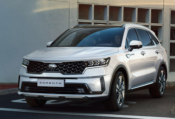
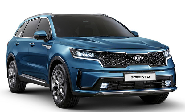
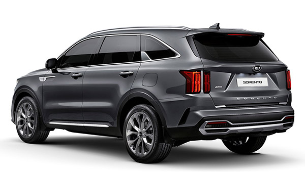
Finally, official photos of the all new Sorento.
And it looks even busier than what I thought.
I think the general shape is fine, but there are so many busy, unnecessary details everywhere. Black plastic trims, chrome stuff, vents everywhere. Just way too much for one car.
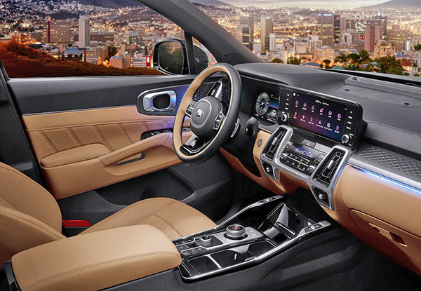
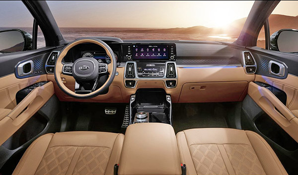
Same thing inside. These center vents also look really weird. And again, with so many lines and shapes everywhere…
Otherwise, it doesn’t look or feel like a smaller Telluride at all. Which is fine I guess. And avoids competition. (if you want something classier, you’ll have to pay more…)
It looks more like a big Seltos with a bit of Kia Soul here and there.
No other details yet. Except it will be offered as a Hybrid as well.
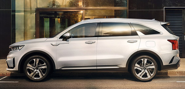
Is that little piece of something a design element on the side back window?
From the full side view, it looks generic styling. The rear “D” pillar is not well done with the sloping downward treatment. New Serento exterior is just okay styling wise.
It looks fine and will be a hit. Do not confuse light reflection with "business."
With the exception of the gaudy looking vent and unusual C-pillar design detail, the basic profile kind of looks like an Audi Q8. You might have to squint a little to see it though.
Think the Seltos looks good in person and this has the same styling cues. Now fix the Sportage.
Way too busy. That side C-pillar dorsal fin is so stupid.
This is not as successful as Kia/Hyundai’s larger SUVs. This kinda sucks.