2021 Hyundai Accent
Last Updated:
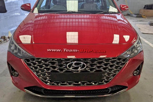
It looks like the little Hyundai Accent is getting a mid-cycle refresh soon.
Which now makes it looking a bit weird. It seems Hyundai is pushing this triangular design on everything these days. It looks OK on a car like the new Elantra that was design from day one with that new look in mind.
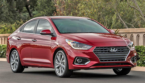
But adding triangular shapes to the current Accent designs just ends up looking odd. (It is similar to what they did with the refresh on the previous Elantra)
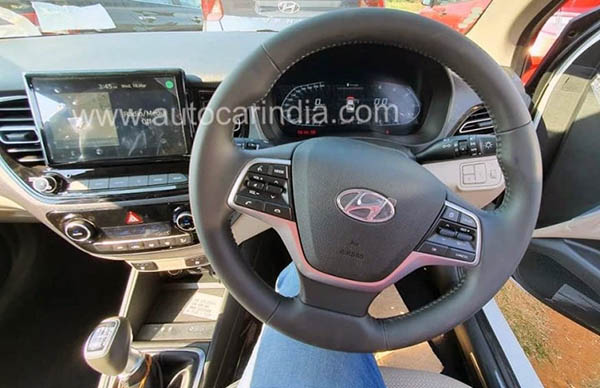
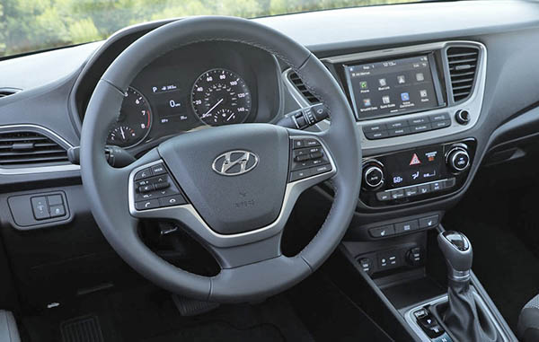
Same thing inside. No triangles here, but why replace the well integrated screen with a stupid tablet design that looks like a cheap after market unit from Pep Boys?
In the battle for the cheap sedans, the new Nissan Versa seems so much better looking than this. Inside and out…
The new front end looks better than the Elantra refresh. But that tablet sticking out of what is essentially the exact same dash looks terrible. Maybe it's a little large than the integrated unit, but come on. Can we get over the tablet glued to the dash look already?
agree that the new screen seems a retrograde step. Additional comments on the newer dash… they went from a highly readable instrument format (big round dials) to a "designery" LCD instrument panel similar to what the new 3-Series has.
the steering wheel buttons.. too many and too close to each other.
simple sometimes is best, think of the older generation folks who buy these things, they will be confused over all the buttons and never use them!
I bought a 2018 Accent Limited two years ago and I love it. While it's not fast of fancy, it does everything I need for a daily commuter car. It's been problem free and gets great gas mileage – way better than the EPA estimates.
I really like the styling on my car, both inside and out. While I won't pass judgement on these changes until I see them in the flesh, I'm not happy with what I see in these photos. That front end doesn't seem to go with the rest of the car, and while a bigger screen might be nice, I prefer my integrated screen to the taped on iPad look that is seen here.
"No triangles here, but why replace the well integrated screen with a stupid tablet design that looks like a cheap after market unit from Pep Boys?"
Because they added a bigger screen and it wouldn't fit the existing surround
At least the new front grill doesn't look as bad as the uggggly new Sonata grill with the sad catfish look!
Not just ugly. Hyundai ugly.
What's the obsession with worthless close ups?