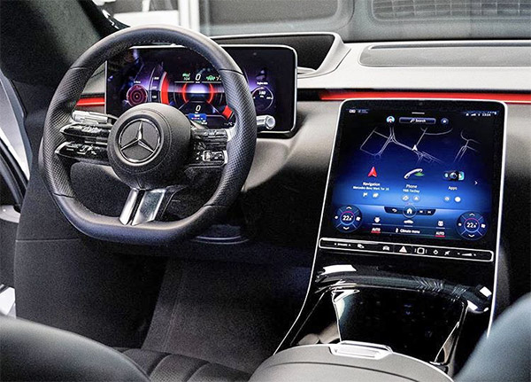
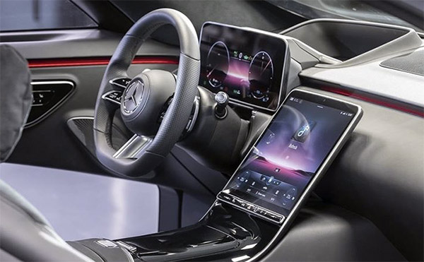
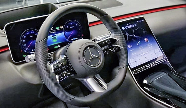
2021 Mercedes S-Class interior: Screen city!
Last Updated:
At least on these early pictures, I think it is a case of “too much”.
They even added a head-up display behind the 3D screen right in front of the driver.
The giant centered screen might be a first for Mercedes, but the Tesla Model S had it in 2012.
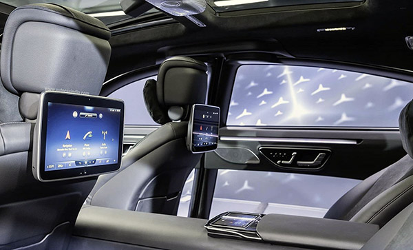
The rear seats also have 3 screens! And the ones attached to the rear of the front seats still look cheap like Pep Boys units.
Not sure what is going on with the lower part of the doors??? Are these giant screens too? With cameras on the doors? On top of that, how reliable is all that stuff? Especially from a brand that is not nearly as reliable as their much older models from the 80’s.
This really weird “wannabe futuristic” approach just ends up looking like someone is trying way too hard. Especially when the whole thing is wrapped up in an exterior design that looks 90% like the previous generation.
it’s just really weird.
As I mentioned before, this kind of interior design would look much better in the upcoming futuristic-looking EQS Electric sedan.
From what we have seen of the 2021 S-Class. I think it is heavily based on the current one. Basically all new panels on top of the old car. Keeping all the glass intact. (like the 2020 US Passat) And they might be using most of the EQS interior. All to save cost.
Since these big luxury sedans don’t sell that well anymore…
What do you think?
God I love the Pep Boys references!!
That is NOT the actual interior – it is a mockup. Note the vents, start button, etc. missing…the HUGE a-pillar etc.
NOTHING about this says luxury
This is what electric benz interior's should look like… BUT not an S-class which is supposed to be the epitome of LUXURY.
Worse than all the screens are the graphics themselves. The HVAC part of the screen is soooo cartoony looking- no luxury what-so-ever.
God this is bad
I think this is a mock-up or concept as the production model has vents behind the screen
Why are auto manufacturers always 10 years behind with computer hardware and software. The OS looks like MacOS 10.6.
This is hideous. They can not find a better way to integrate the OLED instrument cluster other than leaning a tablet behind the wheel?
Nice! Hope Tesla copy it exactly for it next generation models!
I wish that MB would do this interior. They go a bit crazy with the air vents in their cars. Way too many, too high, and too large. They make the dashboard look like some sort of hospital equipment. Some are shaped like glowing sphincters.
This is the MBUX portal, you can see it in the pics within this article: https://www.carscoops.com/2020/07/mercedes-offers-first-look-inside-the-2021-s-class-and-its-new-mbux-infotainment-system/
The driver's screen looks like an arcade racing simulator from the 90s. I also don't like the skeuomorphic graphics. Fail.
"This really weird "wannabe futuristic" approach just ends up looking like someone is trying way too hard"
I agree. This interior looks gross for such a high-end luxury sedan.
They say all of the screens and electronics improves safety. But this is a joke.
All of these screens create way too many distractions. And things that will make the driver take his/her attention away from driving.
It's just too much going on at the same time.
Do fhey still include a windshield or would that be considered a distraction?
What nonsense Vince. One appreciate your takes on things, but don't get it twisted with trying to claim it's the same exact vehicle.
It's all new, evolutionary. Since the W220 of 1998, it's just been evolving the design. W108 (1965) through W140 (1991-98), were mostly evolution.
The "same car" would be the current S-Class which based on the W221 launched in 2005.
The incumbent W222 S-Class was the only RWD Mercedes-Benz sedan not on modular MRA, being developed during last Recession.
Outgoing W205 C-Class debuted Modular Rear-wheel-drive Architecture in 2014 and moved to E-Class in 2016 and CLS in 2018, whereas S-Class was simply a new tophat with revised underpinnings.
This new generation W223 is the lead vehicle for MRA II, the second generation modular rear wheel drive platform for Mercedes Benz cars.
If you're going to be posting news, you have to be credible about what write and factual. Otherwise it gets annoying real fast.
Dr. James – Carmaker1
“ All of these screens create way too many distractions.“
It maybe on the onset of just looking at it but modern jet fighters have much more screens in the cockpit and the pilot loves the additional info. Tesla Model S owners love their screen setups too which is similar to the new S Class layout. I think if you do buy a next generation S Class you will love it too like those Model S owners do.
It’s an S-Class, ALWAYS has been a showcase for technology and it’s 2021 so what did people expect
missed opportunity!
Lots of very bright screens, does no one drive at night any longer, all these screens would kill your night vision. On the flip side, do these screens wash out in bright sunlight? can you see anything on them wearing sunglasses? How about polarized sunglasses ?? (many boat owners use these)
skeuomorphic graphics – this could have been a great opportunity for MB to lead and come up with a new paradigm for showing critical vehicle information… don't really see the point in a digital RPM gauge, especially for a hybrid – top picture looks like a video game. Maybe this appeals to a younger crowd but I always thought the S-class was for a different age group. Few physical buttons (most on steering wheel) – have to take your eyes off the road to adjust things on screen – very distracting!
weird integration of HUD and driver's "dashboard" Center screen location and angle are weird, how will this fare in sunlight? wasted space under the center screen and central tunnel..
the interior seems a bit claustrophobic with the huge front-to-back central tunnel.. is this for the battery?
I never thought I'd miss this, but the 1970s American cars with 3 abreast sitting in front and back were SO MUCH more comfortable. Nowadays automakers are building these huge cars (and SUVs) and most seat 4 comfortably… seems to be a retrograde step
I never got the problem that people have with skeuomorphic graphics. When i ask people why they're so horrible, they just answer "Itz bad because itz bad, okay?" or "Apple abolished skeuomorphic graphics so everyone should do the same", which are very simplistic and low IQ justifications imo.
Too bad they couldn't have continued developing their horizontal double-screen format, it looks really classy in the current S-Class and could have easily been tweaked for the second/central screen to dip down a bit lower/deeper into the space where they now have a separate vertical screen. M-B has always been such a trailblazer, yet this interior wouldn't look very far out of place in a (Chevy) Trailblazer. I think something like the upcoming Escalade screen layout would have been close to ideal.