2021 Mercedes S-Class: First official look inside!
Last Updated:
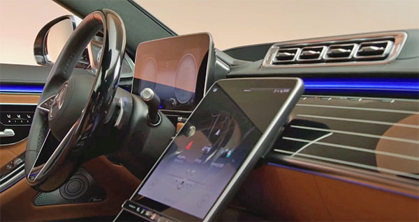
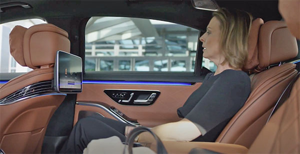
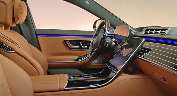
The new S-Class interior looks very impressive in many ways. It seems to be a very nice, flowing design for the most part. (Except for these stupid tablets stuck into the back of the front seats. You would think for that price they could find a more elegant solution)
The screen behind the steering wheel doesn’t really look special or premium either. At least on these pictures. Overall, it still feels like this interior should be wrapped into a super modern design like the Lucid Air. And not a car that looks 99% like the one that came out over 7 years ago.
This seems to belong more inside the upcoming EQS than the regular S-Class.
That floating instrument cluster is so ugly. Worst Mercedes interior in years.
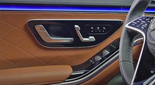
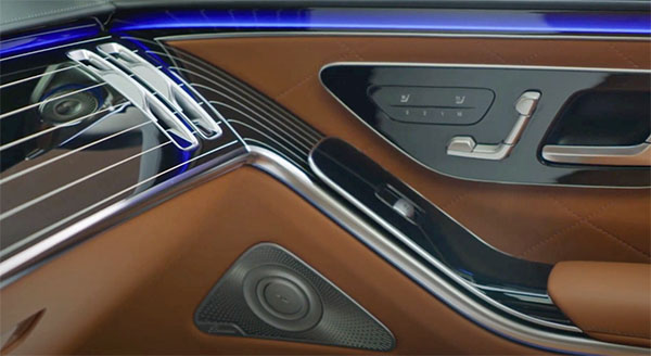
I like the detailing. Very art deco (like the wood flowing into the armrest in the door). But i agree that it doesn't scream "S-class" to me. But i'm sure the materials are lovely. The interiors are far from being the biggest problem with modern Mercedes. It's a shame the exterior will be as shapeless and soft as most recent Gorden Wagener Mercs. A bit of W126 inspiration would be most welcome.
Too bad, tired looking people can afford it.
What happens when the sun hits all that glossy plastic?
The right half of the wheel is hard, the left leather?
Agree, with all of the above. Especially Ralph and the Captain. Those screens look cheap and horrible.
Thank the Lord people don't gel their hair like they used. Those bean bags stapled to the headrests would look greasy brown meat wrapping paper in a few months.
Air vents are unique, smallish rounded rectangle shaped! Huh?
If i could, i would take a Toyota Century over this any day of the week.