2022 Honda Civic sedan: the “concept”…

Last Updated:


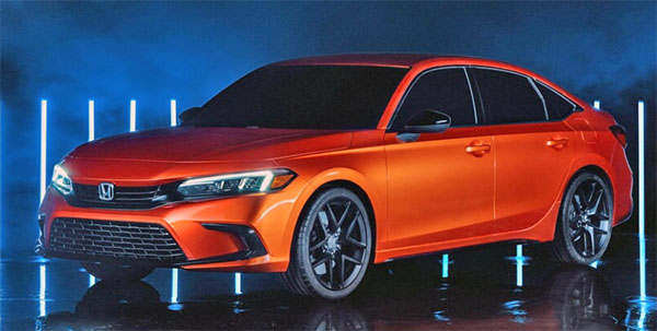
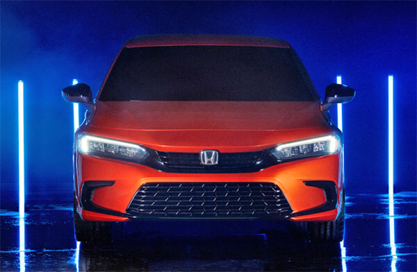
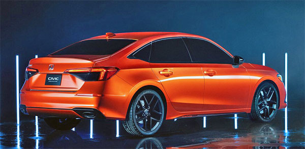
This is a “concept” only by name. Since this is basically 99% of the new 2022 Honda Civic sedan that goes on sale next spring. (Add some chrome trim and replace the huge wheels and this is it…)
So far, it has much less personality than the current version. It basically looks, as we knew, like a smaller Accord.
Which is just OK…
It now seems just like “another sedan”. It could actually be one of these many Chinese sedan designs we see on the web every days.
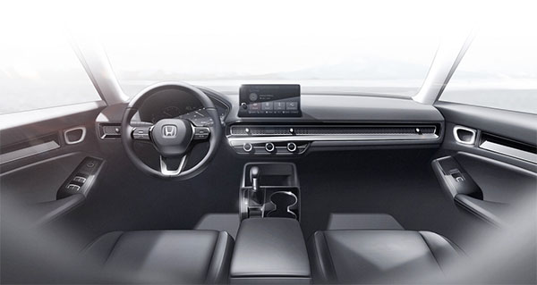
Things also look much more conservative inside. The nicely integrated screen is replaced by a tablet sticking out.  And the whole thing feels like an older generation than the current car.
The current car is a huge hit. And a fine car. I am not sure if this one will be as popular. Since it really doesn’t look better than a Jetta, Elantra or Corolla.
I think the hatchback version will look nicer. A bit more modern and much cleaner than the current mess. At least it will be more practical.
This is not really a disappointment since we had seen so many illustrations/spy shots. 
Still, not great news… 

Conversation 10 comments

  1. Agree to disagree. This exterior and interior is more conservative but will age much better than the current civic, which does NOT look newer than this new generation.

  2. Imo, getting rid of all the fake vents and overstyled design details is an improvement. That said, it is definitely way more conservative, inside and out. Not exactly the direction that Honda should have went with the Civic.

  3. I do agree about some more conservative designs aging better. I think most generations of the Jetta still look good today.
    But I also think the current Jetta looks better than this. As well as the Mazda 3 sedan.
    This has a generic Asian design look that you currently see in many Chinese designs.
    And it is still basically the Accord design. Except the Accord still looks a bit more modern than this…

  4. Honda scores an impressive double fail. First with using Twitch to reveal. Second by making a VW design look dull.they could have cleaned up the prior design's fake vents and made something less anonymous. No one fails hard like Honda Design.

  5. This next gen design is hopelessly dull and uninteresting. I don’t see it repeating the successful run of the current gen. Major fail.

  6. I can't believe I'm going to say this but at least in the looks department, I think that the Nissan Sentra is the one that is doing the best in this segment.

  7. As a designer, I disagree. Yes it is more conservative, but it is much more elegant. I think it will wear much better. All those fake vents and busy crease lines going nowhere on the current Civic is tiresome.

  8. That interior reminds me of what I liked about my old 77 civic in its simplicity.

    The busy, complicated look of most dashes is kinda stressful on the eyes.

  9. The current Mazda 3 and Nissan Sentra are evidence timeless does not mean conservative. This "prototype" looks very full as it is, which means production will be an extreme snoozer. Honda has made this mistake before with the 9th generation of the civic.

  10. This car makes the VW Jetts look exciting, that's like calling beige a hot colour.

    Didn't Honda end up redesigning the old Civic after just a year or two because it was super boring and sales stumbled. I guess even a big company like this can't learn from it's past mistakes.

    Good luck, you're going to need it. As even the old boring Sentra is a design champion.

Leave a comment

Your email address will not be published. Required fields are marked *