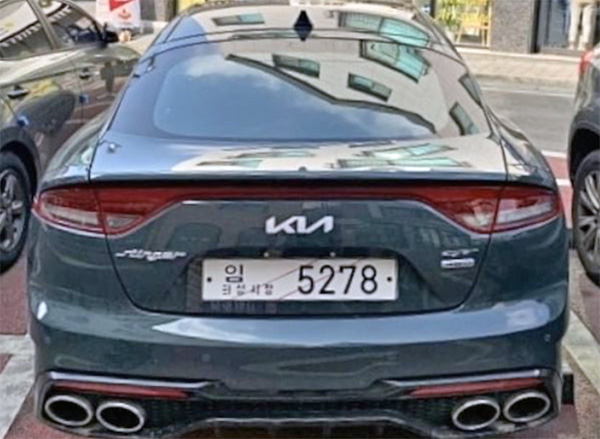
New Kia logo: king size…

Last Updated:


We have seen Kia’s new logo before. But on this new Stinger, it does look pretty huge. And almost weird.

I am not sure there is such a large amount of “Kia pride” around. It does look better than the old one. But to have the logo that large is just too much for me. I know Kia now makes excellent cars. But they still do not have such a great image in most people’s minds. 

What do you think? Too much?

Conversation 7 comments

  1. Yes, about 25% too big. Should have kept some sort of border around it too (like pretty much all other logos). It looks a little aftermarket without.

  2. needs maybe a few more exhaust pipes coming off the roof. And a few side boat port holes . I for one am hoping it will have a 49 inch tablet screen mounted in the trunk.

Leave a comment

Your email address will not be published. Required fields are marked *