2022 Honda HR-V: this is it…

Last Updated:

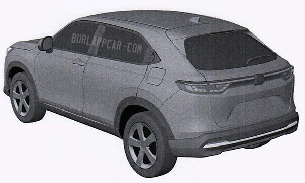
I remember last year when I first started posting spy shots of the 2022 Honda HR-V. Many comments were quite rude. Some insulting. And others even ungentlemanly and unladylike…
Yet, here we are.
As you can see, the spy shots didn’t lie, this was the next generation HR-V all along.
I know, I know, Honda has claimed the upcoming HR-V that will be unveiled in a few days is the “world version”. Explaining the US is getting their own model.
This is just PR BS. Or code for “the one for the US will have different lights and bumpers”.
Honda is not making 2 HR-Vs.
They also mentioned the new generation will be available with a hybrid option. (Which will probably be the only version for Europe)
The main difference for the US will probably be the lack of Hybrid. Or it’ll take Honda their usual 2 years to sell the Hybrid in the US. 
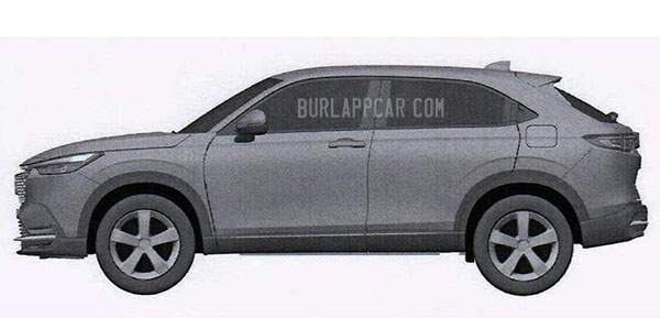
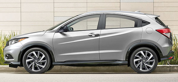
Either way, the new HR-V is a complete departure from the current generation (the only thing left from the current one are the rear door handles)
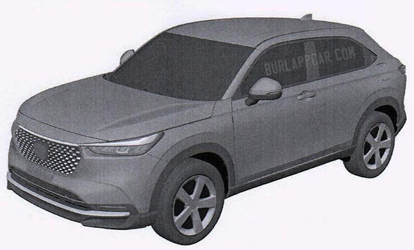
People who like the cute rouned look of the current model might not like this more angular design. (There will be tears…) In many ways, the new one doesn’t seem as modern. Like if it is trying to look more trucky. (Windshield angle, flatter hood) But the overall look is still very much a car on stilts.
The rear lights seem very similar to what we have already seen of the next Honda Civic Hatchback.
I do like the much simpler design. Look, there are no stupid useless vents under the front headlights! That’s progress! Same thing under the rear lights. Finally clean! Most of that vertical plastic crap addon is gone.
A similar design direction could look great on the next CR-V. Even the next Accord (If there IS a next Accord…)
What do you think?

 

Conversation 13 comments

  1. Yep! This IS it! Interesting new design direction for the grille. The front looks like a better version of that new Ford look which debuted on the Focus Active.

  2. I'm outraged ! You, Vince Burlapp, should be impeached for updating new honda hrv photos!
    – I'm kidding. I couldn't give a crap either way. I just hope the new hrv comes with a 68 inch tablet screen. I like to watch Married With Children while i drive.

  3. I'm disappointed the back lid isn't sloped more. Sarcasm off. Granted the rear door makes for a more pleasant experience for humans, but I'm not digging what looks to be less space because of that hatch. You are going to have to be careful with anything moderately bulky and having it fit, or scratching that glass. Maybe it's made up by what looks like more HR-V after the rear wheel well.

  4. Take away the slash marks on the current model and the side views of the two look…not…that …different. Which is not surprising since all CUV’s look…not…that…different.

  5. I am seeing quite a bit of Mazda in that front-end design, which isn't a bad thing, however the profile is looking much more conservative and not nearly as good as the current generation.

  6. Looks good I think, unpretentious. Hopefully they kept the magic seats and the ample space of previous model, and they won't charge a fortune.

  7. Honda has lost their way a long time ago. Honestly, compare their current (and future) cars to their own fresh, innovative designs from the mid-80s to mid-90s.

    I like that the new Civic and HR-V have cleaner designs but, unfortunately, they're both very generic. There's nothing in this HR-V design that says "Honda".. as others have already stated, it looks like an old Hyundai.

    Surely they can do a clean, unique design. Look at the 1990s CRX, Prelude, Legend Coupe, Integra, etc.

  8. Great new front end, but everything from A pillar back looks generic and 15 years old. (kind of like a Mitsubishi product) That "hidden" rear door handle is such a wasted effort with the B pillar so thick and far forward, and the C pillar so sedan-like. I'd much rather see Honda bring back the more vertical rear window and long roof of the 80s civic 2door hatchback and accord 2door hatchback. (I know, even older style reference, but I think it would look more fresh than this thing)

  9. Honda is getting away from "Eyesore Cutesy" design language. They want to attract more adults to their brand.

Leave a comment

Your email address will not be published. Required fields are marked *