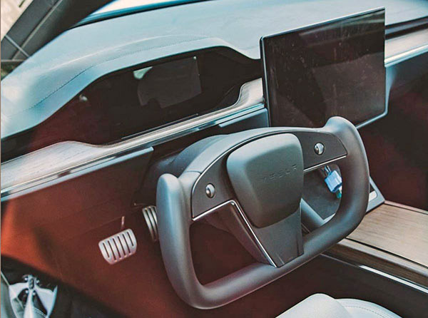
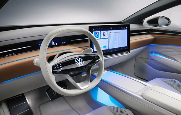
New Tesla Model S interior Vs. VW ID Space Vision concept: simpler is better…
When I first saw early pictures of the redesigned Tesla Model S interior, I knew I had seen something similar, yet better, before.
And here it is: the VW ID Space Vision.
While the VW interior is obviously influenced (to say the least) by Tesla, I think it is much nicer than the new Model S interior. A simpler, cleaner, and better solution to the same problem: the smaller screen behind the steering wheel.
VW designed a very skinny screen that fits in the same space as the dashboard vents. And yet has probably all the info you need. Instead, Tesla designed a weird large bump that clashes with the main center screen.
A large center “floating” screen will always remind people of Tesla Interiors, no matter what. But I really think the VW interior is a superior design.
This is a concept, so I’m not sure what the real thing will look like. It should look exactly like this, and it really could. There is nothing in there they can’t mass produce. But who knows…
What do you think? Would you still like the Tesla interior better? (I am not talking about the stupid and dangerous “yoke” wheel…)


