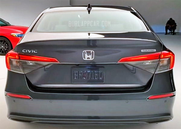
2022 Honda Civic Touring: more pix…
Last Updated:
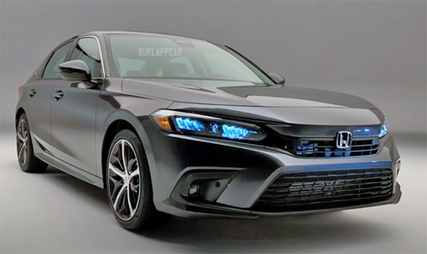
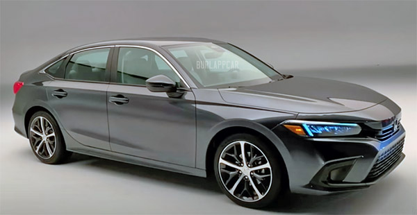
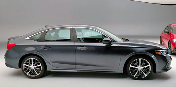
To me, these look better than all the previous shots I have seen. Sure, it’s not original at all, since it is basically the same design as the 3-year-old Accord.
But it looks just fine for what it is. Even quite upscale in this higher end version.
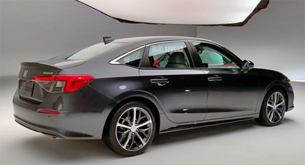
The taillights are even quite pleasant looking.
Whether we like it or not, this will be everywhere soon.
What do you think?
This reminds me so much of Subaru; like the bland Forester which is basically a rectangle and plain as vanilla ice cream does carry somewhat of an upscale feel to it.
As far as Korean competition, it doesn't try to go against the grain like the strange exterior lines/creases of the new Elantra. And the Civic is no a 'facelift special' like the Kia K3.
I hope the higher trims offer a rear armrest as the one featured in the video below didn't.
Is this a better car than the Mazda 3 minus AWD? Not yet.
I'm also interested if the hatch offers even more premium equipment over the sedan or is Honda still playing "Plain Vanilla" on the piano?
I dunno Vince. I've become very jaded as of late, I don't dislike it, I don't really care. Although seeing something in the flesh is a must before one can really have an authoritative opinion. Based on the images I've seen thus far, there are a few things that particularly bother me:
The Chevy impala-style hood cutline- I hate it. It has a producty tongue-depressor execution with resultant panel that no doubt will have some rippling and baby-butting with sample variation. In contrast, the Kia K5 and Hyundai Sonata hoods are masterful and daring in this day and age – I don't see it mentioned often- One piece!
The taillamps seem strangely large with ample hollow, empty spaces inside. I'll be curious to see how they fill that acreage with techie-looking distractions.
The finicky, uncomfortable sculpture that forms the protuberance/leading edge of the hood. It's odd, uncomfortable.
And lastly, that badge in the middle of the grill. With the lights so close it gives it a mousey, cutesy feeling.
*I meant Chevy Malibu hood cut in the above comment*
Great observations! Thanks!
i hate it. its ugly and boring. it looks like a watered down version of the last Civic. Honda please retire the generic clunky chrome bar grill and horizontal headlights
So the Sonata and Civic swapped rear ends. Except the Civic got the Sonata from six years ago.
The lights remind me of the 1988 – 1991 Civic sedan. Nice nod to the Civic's history
Honda does not know how to design taillights.
The Accord, which this new Civic design takes cues from looks way more modern than this. To my eye, it looks way more dated than the Accord and the Accord has been out since 2018 model year. The concept looked better, but still conservative, so the performance models that come later might at least be passable, if barely. The interior is not doing it for me either.
Am I the only person that sees last generation Hyundai Sonata tail lights?
I think it's nearly pointless to criticize the styling of this car as it was probably steered very heavily by consumer clinics.
I can see it now.. "Maria S.," age 34, unmarried mother of two, works part time as a dental hygienist in Apple Valley, CA earning 55-60K/year. Lives in an apartment with two kids and her aging father.
She wanted something "that looked just like the Accord, but for less money."