Auto Show notes: Mazda 3
Last Updated:
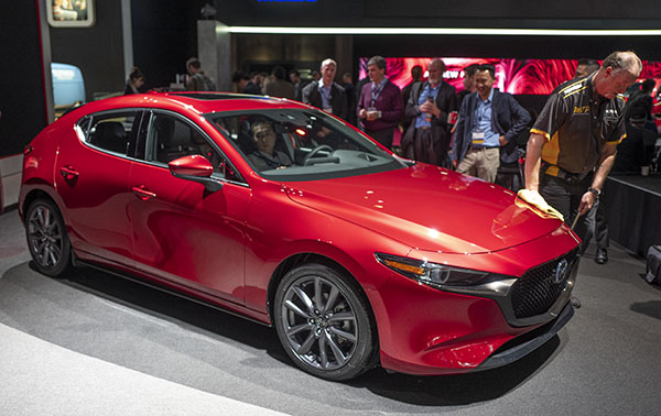
I was eagerly waiting to see the all-new Mazda 3 in person.
The design does not disappoint in the flesh.
While the sedan is a super classy and modern design, the hatchback is a real stand out.
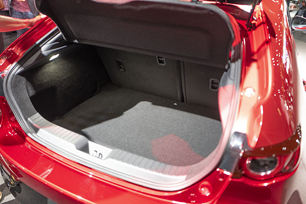
Behind that super thick C pillar, is a pretty roomy truck. Although the hatch doesn’t open all the way down to the cargo floor.
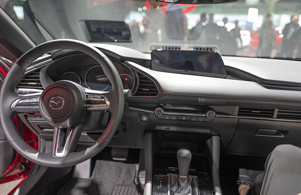
The inside is modern, but far from futuristic.
Actually, more like an Audi A4, but more modern.
The tablet is there. But at least, its design is integrated with the rest of the dashboard pretty nicely. It has a nice shape too. Not just a rectangle sitting on top of the dash.
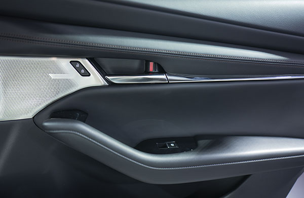
The door design is modern and simple.
That super large C pillar is the main event of the hatchback design.
And here is the result. Pretty much a small cave for the rear seat passengers.
I guess it is not a problem if you have people in the back seat once in a while.
But for small kids, this would be pretty depressing…

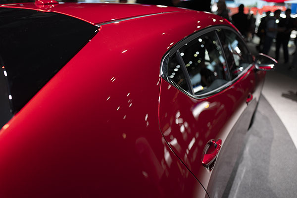
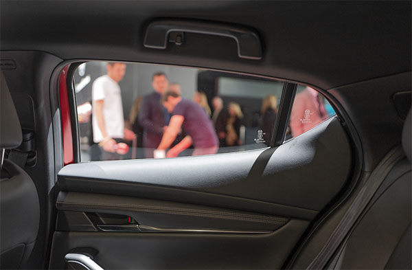
I'm pretty much on the fence about the 3's exterior styling.. it is definitely polarizing since it is trying to inject some style into the pretty boring compact hatch market (see Corolla Hatch, Elantra GT, Forte5, Versa Note and other similar-looking hatches).. but wow, that rear inner door panel is rough to look at!
That hatch is nice!!!! It looks so slick, mean. It is a head Turner indeed. Though I dont like the interior of the rear doors. It looks tacky. But on the exterior it is for the design.
I'm 5'8" if I sit back there I wouldn't be able to see without leaning forward.
I hope Mazda includes car sickness pills for backseat passengers. Wow, what the heck were they thinking? Sedan however, looks stunning.
Nice design, but it suffers from the Camaro issue…very bad blind spots and a really small rear window. Mazda should have included the digital camera rear mirror as standard, but they don't even offer it.
That stupid C-post is a deal killer.
Seems to be more hype than substance.
I guess that sometimes one has to sacrifice practicality for looks
I will pass the hatchback. When design makes the car very interesting and not practical, it is not a winning combination beyond the showroom.
"Seems to be more hype than substance."
Zoom,zoom.
It would have been cheaper and "Edgier" to dump the back window and put in
a LCD display that shows what an appropriate sized window would show.
Clown car.
The strangest thing about that rear side door is the way they designed the interior trim panel; a big plastic wedge BLOB propped up on top of the rest of the lower door trim.
All convoluted angles there makes a very UNclean interior design out of what outside is a really clean shape.
To me, the exterior of the current hatchback is a very well proportioned and sexy design. The exterior of the next gen version is a shapeless mess.
It’s amazing how Mazda was able to nail the exterior design of the sedan (I actually think the next gen version is a huge improvement over the current version), but totally dropped the ball on the next gen hatchback’s exterior.
So Mazda really took this zoom zoom thing too far in the new hatch, at least for rear seat passengers. They will now get the same experience, minus the performance of a Camaro. I actually love the new sedan styling alot though, just not sure I can get over the idea that they replaced the multilink rear suspension with the torsion beam. I am waiting for the reviews before I give my final verdict though. The styling in and out blows the VW Jetta away.
VW Jetta is not exactly a case of attractive design.
Sedan is nice but needs a bigger C pillar. You can still see out the back windows-yuck!
I couldn't agree more. I think the exterior already seems really dated. The interior is better and much more modern looking, with the virtual dash design, but I still think the new 3 is better still.