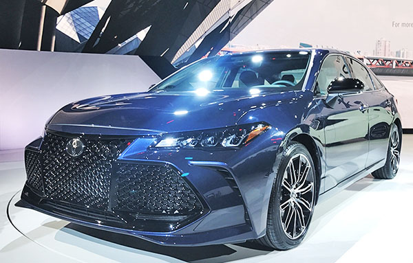
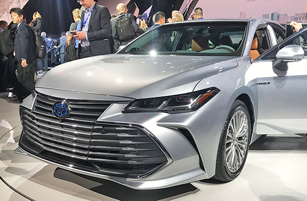
That huge 2019 Toyota Avalon mouth in real life…
Last Updated:
Wow… This looks even worse than in these ‘live” pictures.
Who designed this and who approved it? So many people are responsible for this.
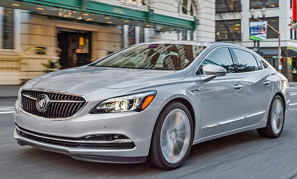
And here it some of the main competition in the US. Like it or not, these are so much more tasteful.
The new Avalon grille design shows us the sad effects of hard drugs at work.
(just don’t do it, its not worth it)
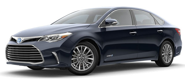
As a reminder, here is the current one. It’s fine. And does look nicer in real life.
And by the way, there is an official $3500 off the 2018 model. If anyone here is interested in an Avalon.
Before the horrible one comes out…


That is a bizarre front end. It'll be at home in Garden Grove or K-town LA for sure. Has a JDM feel to it. I'm perplexed as you are in how this came to be offered for the U.S market.
I can't beleive what type of market or business analysts and designers work in Toyota. They produce reliable and good quality cars but design language across all model range is extremely weird.
I cannot understand how can Toyota stay as one of the leader in volume sales with that design language.
I have never thought to buy a Toyota and i think i will not think of buying for 100 years more.
Wow, Toyota and the nasty front. Disgusting.
that new avalon grill and the grills on the corolla, various lexuses, camrys, etc all look friggin stupid and goofy. I realize toyota is trying to spice up their image as a dull but reliable auto maker, but they seem to have really lost their way in terms of automotive styling. Some real hideous stuff being pooped out of the toyota factories this past decade to current.
I imagine these will be an absolute nightmare to wash. Only a small portion is the breathing/actual grille space. The rest is solid textured plastic. Have fun attempting to get smashed bugs out of all the corners of that faux screen mesh.
It just seems an odd style choice for such a large car in such a conservative segment of the market. The edgy/aggressive look is still unattractive, but is more justifiable in a compact. Does the demographic that buys most of these really want something with a face that will terrify their grandkids?
I think it’s definite evidence of designers being given bad direction. The Avalon is a large and comfy sedan. It should not be sporting boy racer design elements. The current gen car looks just fine. This next gen version is completely hideous!
In an interview at the Avalon release, the Avalon designer spent consider time with the front end design to make it look sophisticated! LOL!
The grill to me looks like some sort grain separator.. I can it imagine this car bounding through corn fields sheering select kernels for later processing.
Toyota really doubled-down on a bad design.
And yet most other car makers have copied this type of design…