2017 Lincoln Continental
Last Updated:
Again, what we saw last year was not a concept, really.
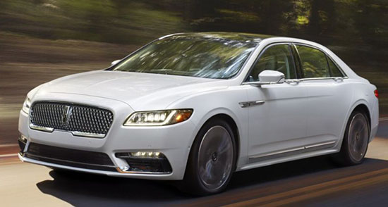
It was this production car with more chrome. A lot more chrome.
I didn’t like it then and I like it even less now.
As I said before, this should have never been called “Continental”. That name comes with a history, heritage and prestige this doesn’t have at all.
Outside it doesn’t look any better than any sedans from Acura. It’s not ugly. Just invisible.
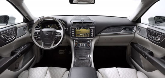
Inside, the vulgar looking chrome from last year has been replaced by some horrible looking wood trim (At least in the version pictured above)
And just like outside, it has zero personality.
I really like recent Lincolns. I drove a MKZ for 3 days and really liked it. And their new MKX and MKC are great.
They were on the right path. What the hell happened???


u r right Vinny. This is a bag of turds. A big nothing. A step backwards.
What the hell is wrong with mark fields? idiot.
I think it's a lot better than the MKS that it is replacing. As for the name, there were a lot worse cars that bore the Continental name. In fact the only series of Continentals that were memorable were the Mark's I, II & III and the Conti's with suicide doors in the 60's and the rest were pretty bad. I believe that Lincoln did not do itself any favors by releasing the press photos of a white car, it should have a lot more presence in a dark metallic paint. I'm reserving judgement till I see it in person but I'm hopeful that this is a step forward for the Lincoln brand.
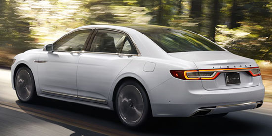
the back look like a 2009 azera to me
Ok.
So color me confused. And I think that's the crux of my problems with this car. Is it intended to be a flagship vehicle in the vein of an S-class or A8, or is it meant to go up against the likes of the Acura RLX and Cadillac XTS (both of which prove there is virtually no market for overpriced, non-rwd, ill-defined vehicles). And on top of that, when I compare this car to the MKZ in the looks department, the MKZ looks more substantial to me. Some of the styling choices just seem so bizarre to me (I'm looking at you, doorhandles, grille, greenhouse, profile, and taillights. I guess that's pretty much the whole car lol). A car with the Continental nameplate should not suffer from this kind of fate.
This car seems aimed squarely at the old Town Car crowd. Liveries should be very happy…
Missed opportunity! I feel like they rushed it when the concept made a splash and got hopes up. Zero originality, the interior is the saddest part too. The Focus has more design and esthetics. They really had a chance to kill the market with some killer innovation and substance.
Retro Baby!
Are we looking at the same car? The interior is badass. Did you see the seats? I bet you other makers will be copying the door handles soon. This is the best grill they've had in years. I'm a little let down on the tail lights but the full concept basically made it to production. My only wish is for a V8 and rwd. Lincoln should have showed this car in the burgundy they have on their site, in black or blue. It needs a dark color to shine.
T
gorgeous, upscale, Bentley ish….
Love push button gear selector, great seats
Flagship vehicle, but not against S-class or A8, but E-class and A6.
Size of S-class, price of something-lower-than-E-class.
I wonder if they'll offer a Landau roof option?
interior is great, exterior needed an Italian pen
When your flagship is a tugboat.
I don't like the overall shape or design of the exterior. It has a profile of the Ford 500, even though it's not based on the same platform. However there are some really slick details that I believe will give this a ton of curb presence. What will really decide the Continental's fate will be the performance and legitimacy of the luxury details. If the luxury is just a cheap plastichrome veneer that Lincoln has been trying to fool buyers with for the past half century, then no one is going to fall for it.
January 12, 2016 at 10:15 AM That's exactly what it is, FINALLY a replacement for the Town Car! It's for those who think the S, & A8 are too ugly and the Bentley is too expensive. It's a market with virtually no competition right now. Maybe we'll see some of the thousands of old Town Cars & Cadillac Broughams finally getting traded in!
I honestly don't hate it at all.. and as others have mentioned, there were MUCH worse vehicles carrying the name in the past (I'm looking at you, abnormally enlarged and squircled-off Taurus 1988 model). White paint does it no justice, but dark colors also illustrate the saddest omission from concept to production.. the very Lincoln-like wide chrome band around the lower perimeter of the vehicle.
Surely the Landau/phantom vinyl roof will be dealer-installed. Got to have that for the seniors who really liked those Malaise Era touches…