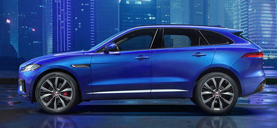
2016 “Jaguar” F-Pace
Last Updated:
Here is the first official picture.
Nor surprises. At all. Since it looks the same as last year’s concept.
I have to say that I’ve always loved Jaguars. But for the past few years, the “Jag” has been slowly taken out of them.
The new XE and XF don’t look like a Jaguar should. At all! And the interiors are downright insulting to any Jaguar fans.
I am sure they are nice cars to drive, but they re NOT Jaguars.
This is the same thing. The concept was boring to begin with.
And that name! Really. F-Pace???
But you know what? I bet this will instantly become the best selling Jaguar ever.


Okay.
I agree with you on a few points, Vince. The interiors are taking a decided step backwards in design (I can't speak towards materials quality). The interiors of the XE and XF don't look very premium. And the name F-Pace is stupid: fin. However, I do like the direction Jaguar has taken with exterior design. I think it has been a step in the right direction. When I see the older Jags, I still smile because they are handsome, but it was time for a new design language.
Beautiful. I hope its reliability is as good as it looks.
If the interior has as much wood and the XJ — I WANT ONE. If not, if it looks tacky and tinny inside like there newer smaller cheaper Jags–Then
I'll take a Volvo XC90 with the light wood interior instead.
It uses the same platform as the super boring and very "non Jag" XE.
(Which I saw in person a couple of months ago, by the way)
The XE has a horrible interior. I don't have much hope for this one to be that different.
I like it, but I see a lot of Dodge Durango in the profile. This is what a compact Dodge may look like!
All "new" Jaguars don't look like Jaguars. They're supposed to look retro classy, not German and Japanese clones. The clones are nice, but maybe for some French company. Also, the XJ has the most repulsive design mistake of all time: the split hood. That along with the plastically from grill doesn't spell: JAGUAR.
My biggest issue will be trying not to call it "P-Face."
You nailed it Vince!
The interiors of the new XE and XF are both just fine when you sit in them. Especially in a darker trim.
What a bunch of babies – 'it's not Jaguar enough.' Please. There was never before a Jaguar SUV. Now there is. It is sporty, modern, muscular, perfectly proportioned. This thing is gorgeous.
September 6, 2015 at 12:52 PM & September 6, 2015 at 1:22 PM
I disagree. For me, Jaguar Tradition always meant unique. Style. WOOD–lots and lots of genuine real WOOD. The XE & XF have no more of that feel than a BMW M3 with Gloss Black & Silver trim. Or for that matter, a Dodge Caravan with the gloss black/silver-edged dash & door trim.