2015 Chrysler 200
Last Updated:
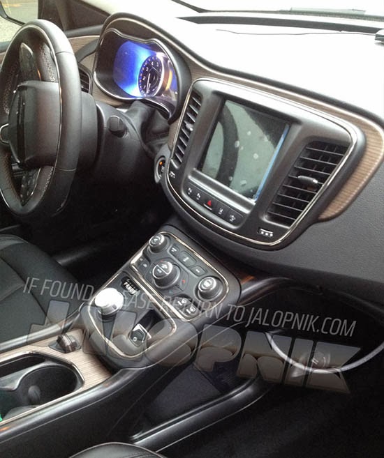
The site Jalopnik has great pictures of the all new Chrysler 200 interior.
And it does look really good!
I especially like the way they use the wood trim. Which seems pretty original.
The floating console with the rotary gearshift look much better than what Lincoln is doing with push buttons.
Maybe there is too much bright trim everywhere.
We’ll see how that looks in real life.
At least this is a huge departure from the past, which is what they really need.
Click HERE to see the rest of the pictures on Jalopnik.


Interesting. I don't really know what to think here. At first glance it looks pretty nice, and, yeah, I think I like the wood, but the interior is much more… BJ AND THE BEAR than it is DYNASTY. In other words, the design, if you can call it that, is focused on knobs and switches rather than on, well, design. I don't think it works for a luxury car in this day and age. Maybe a Jeep of some sort.
Looks like a good design. It's all fairly solid. If I have one critique, it's the dial gear selector. Jaguar/Range Rover does this the best. In comparison, RR/Jaguar is a B&O or Marantz that's made of quality materials. This looks like a cheap Sony sold in the clearance section in Best Buy, made of silver painted plastic. Petty and nick-pickey, I know. But it's right there where your hand sits. So it matters, and it should feel like money.
It's built to a pricepoint, of course it's not gonna be Jaguar quality…plus it's a Chrysler.