Revised Mercedes E Class
Last Updated:
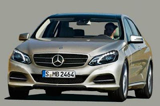
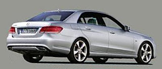
These seem to be the 1st official pictures of the “new” E class.
I must say, it looks really nice. And does improve on the current design, without being “all new”.
The front end is simpler and more aggressive.
From what we have seen in the spy shots, it seems that the interior changes will be pretty modest.
The coupe and convertible versions will be getting similar changes up front at least.


I respectfully disagree. I watched the video before of the headlights and had high hopes. This front end looks inelegant, almost like an Asian copycat of a European style. I've long been a fan of MB, but their styling seems confused lately, especially compared to Audi, who keeps hitting the out of the park.
Still looks like it was designed by the same group that penned the ridiculously boxy 1984 Chevy Celebrity… only with a few X-Mas Lights added to the front.
I think it looks fantastic.
The person saying that this looks like a Celebrity must be legally blind. They look nothing, and I mean NOTHING alike.
A very good car made even better. That being said, I'd take a 5 series any day for the manual alone.
I don't feel strongly one way or the other. It's a solid mid-cycle update of a good looking sedan.
The current E is the best mid-priced car Mercedes has EVER made. This is a successful refresh (meaning it looks different–but just as good) That was no small feat to CHANGE the current model WITHOUT screwing it up!… but they did it!
Poor refresh. Looks like the old 220 s-class during the Daimler-Chrysler era. The rear end which is has sharp lines doesn't go at all with the front which now looks melted… Like much of the other new designs and revamps from meredes(new ML and refreshed GLK).
i hate the redesign of the front. looks aweful, BUT i guess they had to do it because FANCY HEADLIGHTS sell cars. thats the current selling point.
also, the lamps are too round for the boxy edgy design of the e-class.