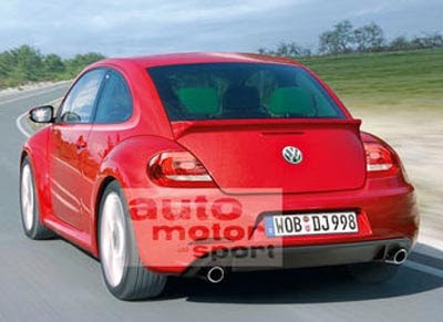
New 2012 Beetle illustration
Last Updated:

This is the most realistic illustration so far.
Having seen the real thing myself, I can tell you it is almost perfect.
-The car I saw in person did not have a spoiler.
-And the double exhaust was on the left. Not left and right.
-The real lights are pretty much correct. Exept the lower part starts where the lower trunk opening is.
-And the lower part of the door had a horrible looking plastic piece . The ones doors used to have to protect from small dings.
Which does look horrible on the real car. This illustration does not have it.

It seems a bit more manly but I doubt men will buy them.
ughh… I dun like the new lights at all. and the shape isn't beetle enough. vw can't even get somethin dat simple right
i think more men will buy this , it reminds of an audi tt
I don't like this at all. I was never a fan though, but I think the last facelift some years ago made the best possible of the design. Other retro cars are just better. Would never choose a Beetle over the gorgeous Fiat 500 or a Mini.
I like the direction they're heading in…a bit more attitude on this car.
What other 'future' cars have you seen in real life? Meaning, because you've seen the new Bug – does that mean you've also seen (for example) the new 200, new Malibu, new VW Midsize sedan, etc?
Just curious
Vince, what does the front look like? From this view, it really doesn't look much different other than maybe a more flattened roof and different taillights.
I'm bored with it already…they should have started with a fresh piece of paper.
Dual exhausts on a Beetle? Give me a break!
It has outlived its usefulness – kill it before it multiplies.
So Vince, would you say that the design of the New New Beetle looks closer to the original or is it just a re-hashing of the current new beetle?
A bit of both.
The profile shows a windshield that is more upright, like the old one.
But in general, it does look like a re-hash of the current one.
It looks the same and different at the same time.
Kind of like Audi did with the second TT.
It's just diluted.
I really hated the rear lights and I told the VW people.
They should be round, no matter what.
The interior is much more upscale, but again, not as much fun.
And of course it has all the modern touches like push button start (on the console, not the dash), GPS etc…