2011 Scion Tc: It’s all new.
Last Updated:
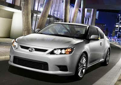
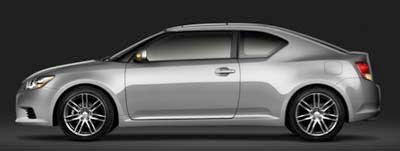
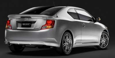
 It does have a tiny bit of the Fuse Concept in the profile. Just a tiny bit.
Otherwise, Scion has, again, come up with a super boring design for what could have been a great car.
Not out yet, and already looking a bit dated…
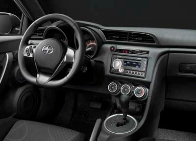
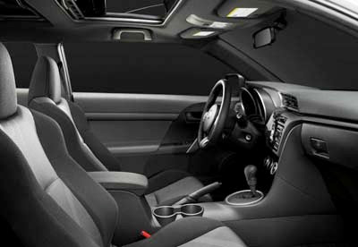
The interior seems much nicer and upscale than the current model. But again, only available in black cloth. No choice.
Engine is new the 2.5 Liter with 180hp. Nothing special.
That’s pretty much the whole story: nothing special.
When it should be. That’s why Scion was created in the 1st place: to be special.
How quickly they forget…

Okay.
The old one may look dated, but at least it's handsome.
This thing is just ugly, as far as I'm concerned.
Holy Crap Batman , it's 1988 all over again…..this company is lost in every measureable way.
I don't know about this. The current one is garbage, but it looks decent. This one, not so much.
I agree with most comments. It seems to me that Scion/Toyota designers are a little lazy and cheap. Looks like the current model as they used the Camry headlights, slapped on a minor 'L' shape rear lights and changed the C-pillar windows a little. All the minor changes and called it a brand new designed car?! I don't get it.
WOW.
That really looks like CRAP.
The old one had some nice BMW lines about it. This one has those squared off blocky truck looks.
I see Honda Accord up front, Dodge Avenger from the side and old Toyota in the rear. It does not look good in pictures, will see it at the auto show this weekend. Maybe it's just not photogenic.
Exterior looks very Japanese. Interior looks very dated. In a '93 Camaro sort of way.
2-door dodge caliber
Ugh, it has the profile of the Tercel coupe back in the '90s!
That is one crappy rear spoiler….
There is no new ground broken here,,this would make me want to look into the new Kia Coup…But it really makes me anticipate the new Toyota/Subaru joint, the FX. That car looks like a Ferrari compared to this.
It's a shame how slight changes in proportion can completely alter what is essentially the exact same shape.. the taller roofline, higher stance and subtly (but strangely) reshaped rear quarters have turned what once passed for a slightly sporty coupe into a pseudo-Corolla 2-door.
I have not seen such a cheap looking interior since the 1980 Dodge Omni.
Special?? I think Scion was more created to be different and youthful. Where else do you see a car that has that c-pillar style? The new look does make me like and appreciate the 1st gen more, but the 2nd gen is a little cool and different. I hate the tail lights, tho.
Once again Toyota drops the ball and is hoping their name alone will save them.
Seems like every auto buff is trying to be a cynical comedian with the best put down.
You do know Toyota is the #1 selling car company in the world, right?
They aren't 'done', 'finished' or going away. Oh, maybe they will slip to #2 spot and still be a massive coporation.
Yeah, criticism of their designs is fine, but the absurd overstatements you guys make are silly.
What do you all drive, Ferraris and Lambos?
Bethca you're all riving Corollas, Mazda 3's, Accords, and so on like most everyone else.
Yet another example of horrible Toyota design. The new exciting Fords, Hyundais, and Kias will be eating Toyota/Scion for lunch
You do know Toyota is the #1 selling car company in the world, right?
WAS. Look at 2010 numbers.
Does that mean that McDonald's had the healthiest, most delicious, finest quality food? Because they were #1 in volume too! You might even say that McDonalds is the "Toyota" of Fine Dinnig & Health Food! (Except that nobody has "Suddenly DIED" because they bought the product–as is the case with Toyota.)
hey Vince, does this new one still got the double moonroofs: business in the front? party in the back?
Leave it to Toyota "designers" to destroy any sense of sportiness the original TC had for this boxy, unappealing lump
People hate what they envy the most.