New Honda Insight interior
Last Updated:
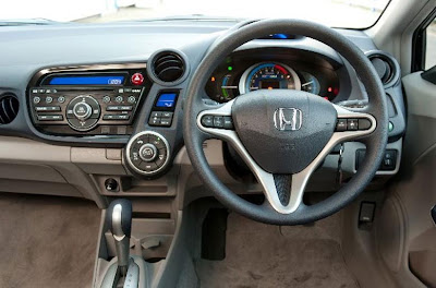
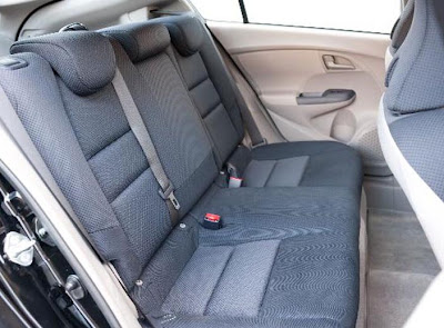
Quite a bit cheap looking. And with that horrible color combo they also offer in the Civic Hybrid.
I’m they do have other colors.

Last Updated:


Quite a bit cheap looking. And with that horrible color combo they also offer in the Civic Hybrid.
I’m they do have other colors.
What do you expect for $ 18.000 and being a Hybrid?
check out: http://www.thecarnerds.com for more info, Vince..
Tito V
Texas.
Im my opinion, it looks pretty much like what u should expect for a hybrid priced under $20K.
How can you make the call that the interior looks cheap based upon these photos? The colors look tasteful, the plastics nicely-grained. All in all it’s well done. You’re off the mark on this one…by a long shot.
Yes indeed, cheap and really ugly. No design thought at all. That weould give me a headache.
It better be very inexpensive to be successful.
Are you glad ??
Very Civic interior. Have seen worse honda interiors.
yuck. all function, absolutley no fashion.
What does “I’m they do have other colors” mean?
Wow, that looks amazingly cheap. Almost like a Chinese Honda knock-off.
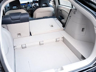
the trunk is so weird. why the depression? and what with the little cubby hole near the rear?
For crying out loud. It’s an economy car, Vince! It’s the lowest priced hybrid (or will be in the US). In this case you’re paying for the technology, not soft-touch plastics. I’m not wild abould the color – perhaps it won’t be the only one.
I should however, in the spirit of the Vince Burlapp site complain about about blatent cribbing…”Hey they’re copying fold down rear seats from the Chevrolet Corvair…how lame!!!”
Woah, the dash and centre console controls are such a big mess!
i think the quality looks quite good, considering the price.
The interior does not surprise it does look like a Civic but you can’t beat a hybrid for about 20 grand this is gonna be about 2-3k less than Civic Hybrid.
….. “I’m they do have other colors.
“
Yes, I’m also.
I agree with Vince, you can not tell what the material are like but you can see how it is layed out. It looks like a discombobulated mess, like a 5 year old designed it at kindergarden. Especially the the way alot of the panels are put into the plastic, it really looks like 90″s GM interior
I like how all of a sudden cheap interiors are OK so long as they’re in a Honda-made “economy” car. BTW, that flat-as-a-park-bench back seat is looks as comfortable as one, too.
i don’t know what you are complaining about, Vince. It looks like the Fit and Civic’s child…and for the price, what did you really expect?
If this thing delivers on both Price and EPA range, then GM, Ford, and Chrysler can basically call it a day…this will become the 21st Century Version of the Model T.
Honda must be using Chrysler’s plastic suppliers. Looks el cheapo.
“Woah, the dash and centre console controls are such a big mess!”
+1….Honda’s layouts are getting hard on the eyes. Just when I thought the Fit and Civic interiors were odd they decide to make things worse! Hey, at least they are reliable and better than anything GM has on the road.
In Japan there will be 2 interior color options:
– Blue
– Warm gray
But so far interior colors varied by market and the color combo in the pictures are from European model. Hopefully we see all black in the US. Unfortunately it seems 2 tone is trendy (e.g. Venza and other new models).
The dashboard looks not cheap and as good as the Civic Hybrid (it would look better by far in black though). See closeups on insightman.com/jalopnik.com.
Not so sure yet though about the seats. Plastic in the back? That might explain the lower price if it’s worse than Civic. Hopefully they offer leather seats in the US which might help.
Typical interior of an econobox.
This looks like a 90s Pontiac inside. I’m sure the maintenance costs will be insane, like all “reliable” Hondas.
what is up with that hold in the cargo floor? is it supposed to be covered? and the front would look better under better lighting and with clean carpeting. i like how it’s not as “hey look at me i’m a hybrid” as the prius
my future car 🙂
Dash looks a bit like an American show car of the 60s.
whiners, it looks fine, if too busy. even when honda decontented their interiors (like most other manufacturers in the late 90’s/early oughts) and used hard plastics, they still hold together better than the industry average.
With the exception of the digital speedometer and bizarre steering wheel design, I actually like the dash layout better than the Civic or the Fit. It looks intuitive and functional. The color combination is classy to me.
i drive a new civic and the dash layout is actually quite convenient. you can see your speed in your peripherals without taking your eyes off the road
vince, i recommend a test drive
A vehicular appliance with all the personality & sex appeal of a entry level Speed Queen Commercial Dryer. I'd sooner spend 18 grand on a piece of lawn sculpture.
A vehicular appliance with all the personality & sex appeal of a entry level Speed Queen Commercial Dryer. I'd sooner spend 18 grand on a piece of lawn sculpture.
Speed Queen commercial dryers sell. Spending $18k on lawn sculpture just looks stupid.
But whatever makes you unhappiest.
someone went mental on the interior