Mercedes GLK Production
Last Updated:


Even though I was expecting ugly after seeing the “concept”. This almost leaves me speechless.
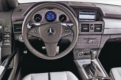
This is one of the worse looking interior I have seen in many years, at any price.
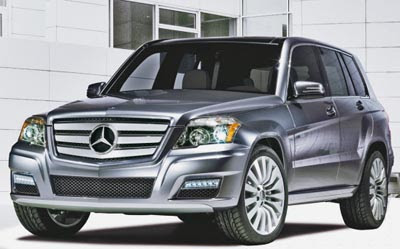
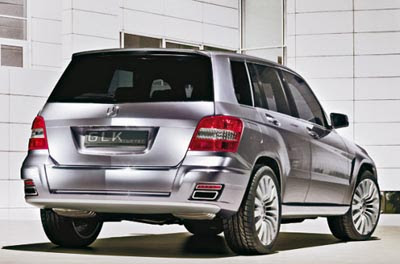
And the exterior design is almost as messy as the interior.
If this had come out of China or Russia 10 years ago it would have been laughed at.
In 2008, this still should be laughed at….

Wow. And I thought the Accord dash was bad.
YIKES!!! Even Honda couldn’t come out with something this ugly. Or could they…
Expect to see a Chinese copy in a month or so.
WHAT ARE THEY THINKING!!!!!!!
This is awfull. I am very disappointed. Early 80’s styling is soooooo not cool. Whoever is responsible for this abortion needs to be fired ASAP
i can’t believe those pictures depict an interior from a $40K entry-level luxury vehicle from 2008. it looks like a cobbled-together interior of 1980s cars made by a do-it-yourselfer with parts from a junkyard. first that wretchedly cheap C-class center stack and now this! what the hell is wrong with mercedes-benz lately? it’s a sad day when i can say “the chrysler sebring’s interior looks far better that this.” they seem to not want to treat their entry level customters very well in terms of interior design (because i really like the exterior of the new C).
seriously, wtf is wrong with them?
This car is German it is Mercedes it is world class leader of design it is best in world. Japanis and Americn are not good as this.
Okay, I had such high hopes for the upcoming GLK. The exterior of it is a bit blocky, and squared but that’s a good thing it comes off as a truck base vehicle, even though its not. Especially in a sea of Acura RDX, Lincoln MDX, Audi Q5, Infiniti EX35, Lexus RX, BMW X5, VW Tiguan. Mercedes in some ways are a trendsetters that influences other manufacturers. And this is coming from someone who really dislikes Mercedes.
I can see consumers who pull toward Jeeps and Hummers taking a long look at this car. Exterior wise it’ll grow, it’s really not bad. In volumes it will sell. But I do have to make one negative comment….the interior three letters….WTF!
There is no other word for it: ugly.
very strange for mercedes, indeed.
those wheels look really nice though.
wow. i thought it couldn’t look any worse, but i was wrong!
wtf is MB thinking? THAT STEERING WHEEL IS AWWWWFUL!
Did Mercedes and GM swap interior parts bins?
Hyundai/Kia at less than half price is the only way to go.
Zastava called, the want the Yugo dashboard back.
Man Pleeeeaaase! This monstrosity will still sell, regardless of what it looks like because its new and its a Mercedes. These stay at home soccer moms will still get the money from Hubby to buy it so they’ll be the ‘hot thing’ on the block. Look at the Accord. Horrible, but people have to have it because its new and its a Honda.
I guess when Chrysler and MB broke up, MB got chrysler’s interior design people as part of the settlement.
A Jeep Liberty is a far better value.
I think it is nice inside and out. It has the G- class look to it and seems very solid. Maybe this is not for
frat boy american taste, but it is very German in design and function.
I thought that it was Chrysler that was to blame for their bad interiors. I was wrong. Since all the suckey designers are at Mercedes, maybe there is a chance for Chrysler to improve!
Beaten by Ugly Sticky
I’m not sure what the point of this vehicle? Is it to chase the design most ugly to succeed?
Perhaps Mercedes Benz is on to something, maybe they’ve decided their luxury SUV needs to be the Ugly Betty of the luxury segment.
Or maybe they needed to design their ‘Aztec’ in order to top GM’s ill fated Pontiac.
To anonymous 8:44 am,
I’m willing to bet a Chinese copy would be an improvement. I think even the Chinese would be embarrassed with an interior like this:)
It’s really pathetic that the dash in the $2,500 Tata Nano looks better than the GLK’s. For that matter, the whole Nano probably costs less than the GLK dash assembly.
is that an 06 highlander?
This car is very cool. Mercedes has allways set its own trends and rarely followed the established ones. The square retro ’80s dashboard is something totally cool and next generation Infinitis and Lexi will have similar designs, wonna bet?
True, people do buy these things because they are mercedes, lexus or bmw for that matter. That dash I do believe is worse that the exterior styling, which is out of a bad comic book
Don’t forget that they still sell the G Class in Europe as far as i’m aware…which is 20 yrs old now or something like that…admittedly it has taken a lot of it’s updated interior from the previous gen C Class but it’s still pretty boxy and people still buy them….
You could see it as a modern take on the G Class then with it’s boxy, utilitarian looks…but people are right,, it’ll still sell. I can’t really think of any Mercedes that has had woeful sales performance…
I really do believe the same people that designed Chryslers most recent interiors also designed this and the new C-class. Ugly and Outdated…Pass!
wooow…. Mercedes thinks that its conceitedness allows her to make errors like this?. Some guys will pay for this monstrosity. A lot of money in design waste miserably…The dashboard seems a heap of old radios he took in a junk. Yet some idiot will buy because she is mercedes. The same that don’t buy Lexus because it is Japanese.
Mercedes thinks that its conceitedness allows her to make errors like this. Some guy will pay for this monstrosity. The dashboard seems a heap of old radios he took in a dump. Yet some idiot will buy because she is mercedes. The same that don’t buy Lexus because it is Japanese.
Subaru called,
They want their Forester back with the right dash put back in…
Even that guy in the picture looks unhappy to be in this abortion.
I totally agree with shell and other posters. This car is a styling disgrace, it’s utterly hideous inside and out, but it will still sell because of the three-pointed star in the grille and because it pretends to be an offroader (even though exactly 0.00% of them will ever venture away from the tarmac). It’s just sad.
Heiko from Stuttgart said…
Maybe this is not for frat boy american taste
That’s because sorority girls will be driving this abomination that daddy bought for them their freshman year in high school. Who cares about the dash design when you can call mommy for a lunch date (hands free) while sitting in line at Starbucks in a Mercedes?
I wonder if there’s a storage compartment for their little white MacBooks.
It seems that there is just one voice that is giving negative criticisms about this car and none of you are brave to really state how you feel and instead feel
that you will get insulted for liking something a little different,
@ Heiko: being an American with “frat boy” taste as you put it, I like most of Mercedes’ designs – even the old school Gelandewagen/G-Class. And I really find the styling of the GL very attractive – simple and handsome. In comparison, this GLK is just a misproportioned interpretation of the good-looking GL design. i wouldn’t want the interior of my new$40K car to look like that of an 80’s Honda Civic. Practical and utilitarian doesn’t have to be unattractive or dated in appearance. I think that a modern interpretation of the G-Class would be more in the spirit of Toyota’s FJ Cruiser – definitely retro but simultaneously very modern. Or even the Thunderbird. Mercedes has made some attractive vehicles. This just isn’t one of them. Just my opinion.
What I find funny is that they copied the Rav4 exterior, from ten years ago. The sad thing is the Tata Nano has a better dash.
Mercedes is on the right track and have been for a long time as shown in these 1988 photos
Do you think the grill is big enough?
I Like the interior.. Some of us want old mercedes designs. Glad to see they are going back to what made them successful in the first place. Vive la merc.
After the breakup of DaimlerChrysler the Mercedes interiors have gotten cheaper and the (2009 Dodge Ram) interiors are suddenly state-of-the-art! Did Mercedes take all the bean-counters, and Chrysler get all the engineers???