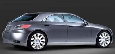
Chrysler Nassau concept
Last Updated:


Nothing really new here.
Just a modern wagon.
I must say, Chrysler concepts use to look much better before Mercedes took over.
And if you think you might ever see somthing close to this in production, remember this comes from the people who brought you the 2007 Sebring…

Please! The chrysler Thunderbolt from ’97 was ugly…as was the Atlantic, which was bug-eyed
I think the concepts have gotten better looking since Mercedes took over
I think its an amazing and original design. It seems that this thing will be destined for production.
I don’t think this design is that orignal when you look at it very clause. I can see a lot of Acura inspiration all over it. Check out the angles.
Wow, a 4 door hardtop! I’d prefer a trunk, but overall I really like it. The Nassau concept is light years ahead of the ghastly eyesores from Japan. This is what the Sebring should have been.
are those speakers in the rear/side of the headrests? Would be cool idea. wouldn’t have to go deaf cranking up the stereo when windows are down, to hear the tunes(unless you want to show off, that is).I like it. Is this a large, or midszied sedan, what? FWD? I wish this were say the new Sebring.
Even if ti started around 20K, if quality, etc, were there…. this thing woudl fly off of lots.
This is how to design a 5 door. I hate “wagons” that look like square-ish boxes.
Toyota designs all their line up to look similar( next gen Corolla will have some form to remind people of Camry, if they make this thing…. do the same with Sebring… make it looks sort of similar, and people will buy it).Sebring has most of what people want, Except The Styling.
Nice concept, but I wished they’d stop teasing us with pillarless 4 door hardtop styles they’ll never produce. 🙁
From the jigsaw-puzzle pieces …er… I mean preview pictures, I thought this would look way better than the Sebring – I was wrong (except for no hood grooves). This looks like those detail pieces are just glued onto the box they came in… which makes it look rather Japanese :-p ____ At least Ford & GM are making better & better-looking vehicles.
10:52: i KNEW i saw some familiar design cues in this concept (esp. the headlights).
the taillights look a bit misshapen and out of proportion but overall i like it.
Looks like a Cadillac Seville from the late 70’s with the slanted funky trunk… yuk!
this is exactly what the sebring should look like minus the hatch it already is similar in shape i can see its the same design language but on this its so much better put this front end on the sebring and a rear to match and u got a “camccord” beater.
looks good, reminds me of the 1st gen Acura CL
Maybe the contest was:
WHO CAN DESIGN THE MOST UGLY COINCEPT for Detroit?
And the winner is…..
Ok, who brought back the Seville from the early 80’s as slapped a different grill on the front?
Betcha it’s got the V4-6-8 engine too.
Wonder if it will be just as reliable.
I’d really like to see Chrylser start to move away from the Crossfire inspired front designs. I was never wild about the Crossfire’s grille and headlights, and seeing variations on the theme on the Pacifica, Sebring, etc hasn’t made me a believer…
Most companies change their design language after two generations of models, and I guess this go-around is the second generation for Chrysler, but I’m really rooting for a new theme for the front ends and as soon as possible.
Wagon-ish… There is too much slope on the rear glass to offer much more cargo room. More like a five-door hatchback (like the Mazda6 5-door).
Please lose the Captcha on the comments page!