2023 Hyundai Ioniq 6: this is it…
Last Updated:
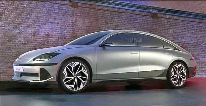
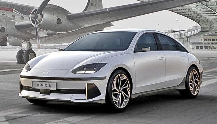
After all the spy shots and illustrations we’ve seen, it is actually weird to see the real thing. The 2023 Hyundai Ioniq 6 ends up looking a bit weird to me.
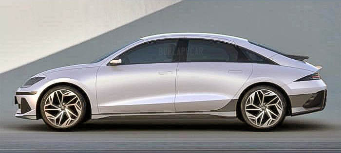
Of course, no one was expecting the fantastic Prophecy concept to translate to production without major changes. Still. At least in these early photos, the Ioniq 6 looks quite busy. Although the profile view is still quite striking. But the very angular trim bits on the lower bumpers are in sharp contrast with the very soft shapes of the rest of the design. There s a lot of unnecessary black trim everywhere. I think the super angular stuff on the bumpers works better on the Ioniq 5.
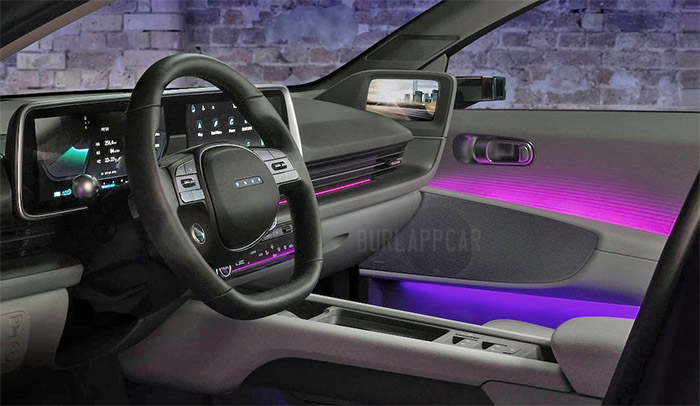
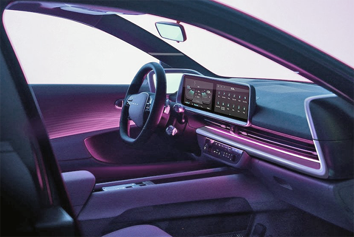
We had seen the interior before as well. And it looks fine. The photo above shows the Korean market rear view cameras that will not be available in the US. These side screens won’t be there either. The interior is a mixed bag as well. Maybe other photos will look better. It just seems designed by different teams. The console doesn’t seem to belong in the same car…
At last, the Tesla Model 3 has its first real competitor. Which is good news.
More on this very soon. The official unveiling is still over two weeks away.
(Thanks to a reader for these photos!)


It would've looked more like the Prophecy concept….if it were built on the G90 platform
Vince, you are absolutely correct in your assessment of the design elements. Those vertical portions under the bumpers at the corners, and the unnecessary black trim almost look like black marker graffiti on someone else's beautiful design.
This could be so much better. Just deleting that horizontal thick black line on the front bumper does wonders.
Sadly, the exterior design is WAY overdone (and looks like some kind of cartoon car).
They wanted to really differentiate from Tesla's bare bones approach. But they went way too far the other way. The design and all of the junk they added to the outside trim will not age well. It will look laughable in a really short time.
But I'm really liking the lighting on the interior door panels. Looks classy and adds an air of sophistication.
They should have taken this approach with the exterior as well.
I like it. The horizontal line on the front bumper could be thinner, but that's quibbling really.
And the interior looks fine to me. Neat without being garish, and devoid of any 90's-style swoopiness.
I think I think the same…the Prophecy was really smooth and simplistic, and this is too with the exception of the front and rear bumper which have too much going on. I wish there they were toned down and kept smoother