2021 Ford Mustang Mach-E interior
Last Updated:
I got the opportunity to sit in the all new Ford Mustang Mach-E yesterday, and was pretty impressed.
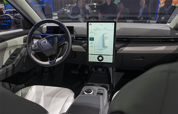
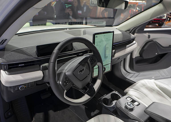
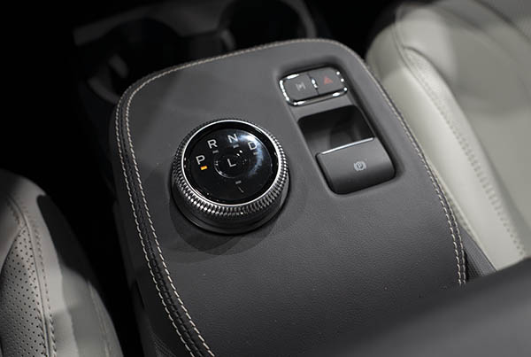
As I think it is a much more upscale interior than the Tesla Model 3 and Y.
In the Tesla, you have the feeling that the cool futuristic design is basically limited to the dashboard. The rest of the interior always feels like a Jetta, or any other generic looking sedan to me.
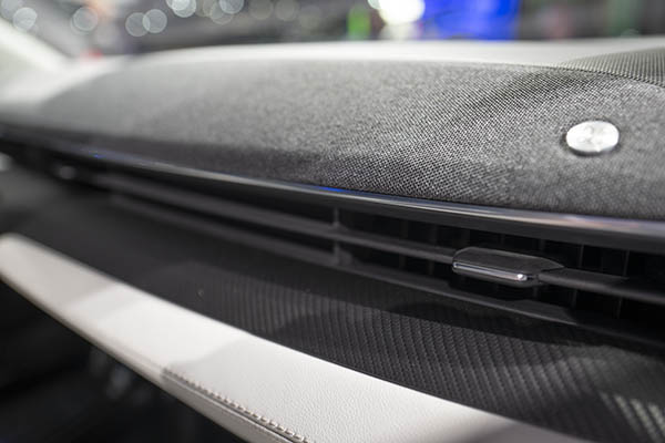
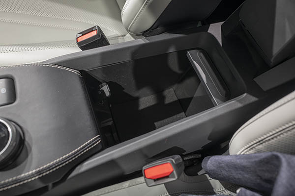
Not so in the Mach-E. Where Ford really tried to design the whole interior.
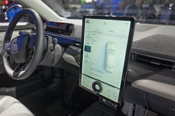
Sure, it is not as striking as the first time we saw the Model 3 and its giant single screen. But it is also a much more upscale feel. With a few different textures. And many nice touches that make the whole thing much more user friendly (But also, maybe, not as original and ultra simple as the Tesla)
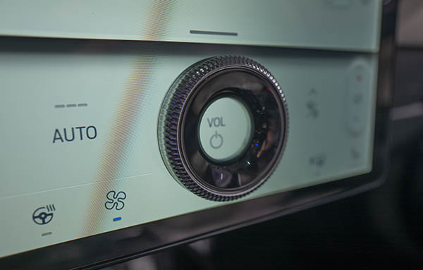
The physical knob on the screen is a great idea.
And it also looks great.
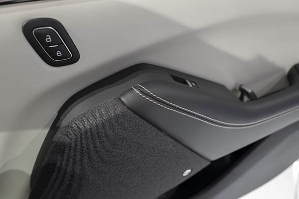
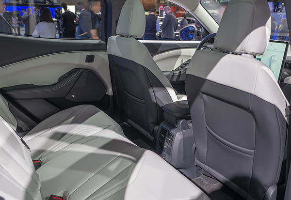
The door design ins also much more upscale and actually more modern than the Model 3.
The rear seat is also roomier.
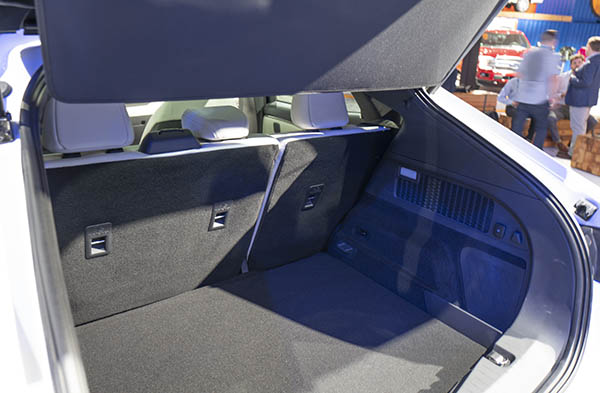
The hatch has a flat floor, but its opening is actually pretty high. But unlike the Model 3, at least it is a proper hatchback…
The Mustang Mach-E is a very impressive car in person.
Inside and out.
And it is truly the brightest star at this year’s Los Angeles Auto Show.

The Mustang purists will hate it. I think it's fantastic, I hope to see thousands of these on the road.
Good to see the interior isn't as cheap as it looked in the press photos. It does look more upscale in person, and it seems way more refined than a Tesla. Ford did a really good job with this car, as they should. If it doesn't suffer from the same quality issues that have been plaguing their latest vehicles, they have a huge success on their hands. GM should take notes. This is how you make a desirable EV.
Telsa needs to upgrade the interior to that of a Honda standard along with putting back the instrument cluster for the 3 and Y models.