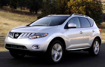
2009 Nissan Murano
Last Updated:


I must say, it seems a little weird at first. But that’s because I’m so used to the current model.
This actually looks great to me.
The front has a concept car look to it.
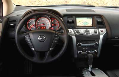
And this 2 tone interior (You can see a bit of the cream color on the door panel) looks amazing.
The dash design is more grown up and upscale than the current one.
This should turn out to be an amazing car. What competition to other car based SUVs.
And it’s good to see they kept it a 5 seater.
The Murano didn’t become a longer and bigger family hauler like others.
I will see it later this week and bring you more pictures and videos.
Thanks to a reader for these.

Wow, the same center console and nav system as the G35/G37.
Burlapp,
Yea, when I saw the interior, I had to send it to you.
The layout went upscale and a little bit of Audi/VW
and Infiniti( yes it is Nissan). I hope everyone enjoys.
– EBM14
Ps- I hope not to see that Chubby Nerd driving one of these, it should be VB.
I think the Pathfinder and Armada should be gone with the wind. The Xtera although not the worse looking truck, also should graduate. Sales don’t seem to be an item with them and it might be more interesting to see the Cube and X-Trail fall into place, but for some reason Nissan’s American boss lacks taste and it too cheap.
Ladies and gentlemen, presenting the new Nissan Aztek!
The front Grill/lights can’t get any uglier… horrendous
Wow! Who will buy Pilot or Highlander Now?
To the following:
a)The new Highlander is a great truck after close inspection. Honda will spawn a new Pilot in the near future.
b)I don’t think this looks like an Azteck at all.
c) Going back to Honda, bring the freaking CrossRoads here. Nissan, Honda and Toyota
have already broke ground with the smaller SUV segment or will further expand it soon….
Nissan Edge
agree
I’m not sure why? or what? is motivating Nissan to keep putting out ‘refreshed’ product rather than ‘all new’designs.
This must be what you do when you’re running short on cash..seems like they’re taking lessons from Ford. Pity.
Jac
I love the interior.
Exactly how much effort did Nissan put into the Murano’s “redesign”? It looks like a Korean concept car, or a Chinese copy of a Nissan Murano. And look, the interior has Nissan’s infamous cheap-looking shiny silver plastic. Why even bother.
This is so much better then the current interior it could be half as good and still be tons better. Hope this is the new steering wheel design for ALL nissans.
I see th Acura MDX a little in the design, especially from this last picture. That ain’t bad. I love the Murano, and the interior is hands down a 100% improvement. Wow, Nissan listens… What’s the problem Ford?????
The instrument panel looks a lot better than the current model.
Nissan has produced some very nice cars recently, but on the inside you can see where they have tried to save money – the instrument panels look cheap. For example, the Maxima has a very cheap looking instrument pod for a car that expensive….
the front looks like a japanese cartoon
The original Murano is, was, and always will be a true automotive classic. It was one of those rare automobiles that looked really weird for about a minute…but then grew into its britches and became cutting edge, then modern, then just sophisticated. Yes, the big-toothed grille was trying a bit too hard (I see many Murano custom grilles out there now), but the interior was beautiful, functional and the entire design pretty much felt unified.
Now we get this ‘clinicked’ garbage. They kept the side window (sort of), kept the ‘floating dash’ (sort of), kept the 5 seats but now the entire surface detailing has become derivative and foreign to the rest of the car. The new Altima, by comparison, is a much more evolved, ‘animated’ form that both relates to the previous model and starts a new design language. I think the Murano should have been a bit more ‘cartoonish’, with a more playful character instead of this formal also-ran.
This makes the new Subaru Tribeca (or even the new Suzuki XL7) look like modern Art.
The front end design is completely overwrought and clumsy. The rear lacks substance and looks like a design that would come from a developing country. The interior is vastly better than the interior in the current Murano, but I’m not sure it’s good enough considering the competition today. The original Murano was revolutionary. This is not a completely offensive redesign, but will probably be nearly invisible to most people.