2015 Hyundai Sonata Interior (Update: it’s NOT)
Last Updated:
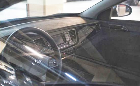
The top picture is the all new Sonata.
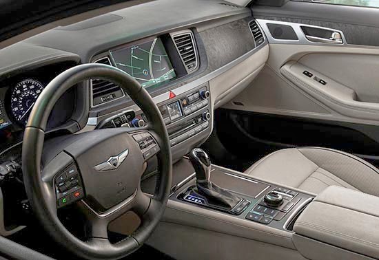
The bottom is the new Genesis.
They look really similar.
I guess the “flat dash” look is Hyundai’s new black.
Let’s hope they aren’t trying to pull “an Audi” on us. With one design of different sizes for every car they make.
That would be too bad…
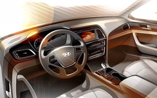
UPDATE: The top picture does NOT match the official sketch (bellow) at all.
So it is probably not the new Sonata interior.
Vince, you got it all wrong. That top picture is the China-only Sonata, called Mistra.
Yes! You must be right. Since it doesn't match at all the sketch released by Hyundai a few days ago.
Thanks. And sorry for the mistake…
See here spy picture that does match:
http://www.worldcarfans.com/114022871014/2015-hyundai-sonata-hybrid-spied-inside–out/lowphotos#19
this foreign crap has to go away they are w the worst ca you can buy
I would call that an update – not a redesign.
Love the flat dash. Thank God they're not doing that stupid swoosh line on the passenger side woodgrain like BMW, Cadillac, and everyone else is doing. Monkey see, monkey do. I've never been a huge fan of Korean cars, but I give that massive credit for doing their own thing. Like Audi, perhaps they realize that a simple, tasteful design adds to the upscale feel of the car. American carmakers would be well served to learn from that.