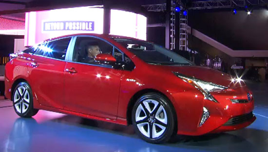
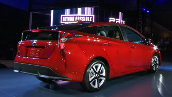
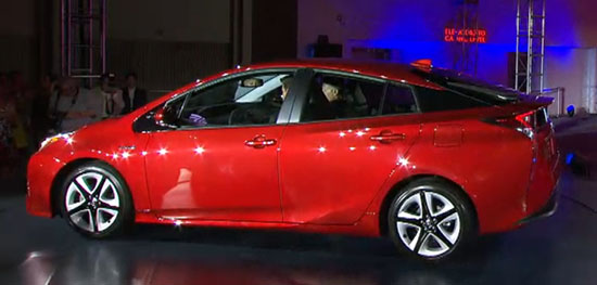
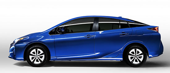
2016 Toyota Prius

Last Updated:

Get ready. Because wether you like it or not, this will soon be EVERYWHERE!
(They still sold over 120 000 of the “old” model last year)

No specs from Toyota yet (And why???)
But it is expected to get about 10% better fuel economy. Which is not really a game changer after over 6 years of the current model.

But that doesn’t matter, since tons of people are waiting to buy this car.

As far as I am concerned, I do not hate the Prius like so many people do.
I wouldn’t buy one. (Because maximum fuel economy isn’t my only priority). But I understand people who do.

I actually think the current one looks better.
This new one might be getting too weird. More modern does not mean weirder.
(Something Toyota/Lexus has a hard time to understand in general)
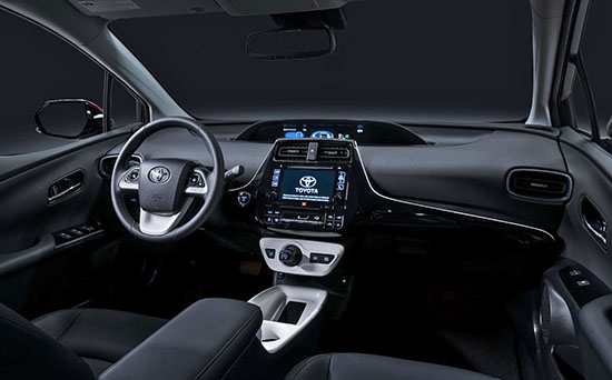
The interior doesn’t seem to be an improvement either. Just a bit weirder.
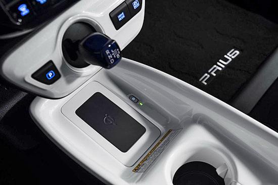
And the “shifter” seems to be in the strangest position ever. Why???
Plus… No more sunroof?

I think this might have a tough time against the much more attractive new Volt.

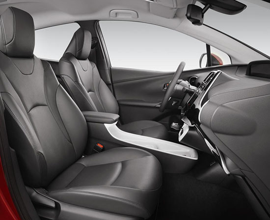
 Is this really an improvement??? Are the headrests fixed now?

What is THAT?? It looks like a small bathtub in-between the front seats!

And the small shifter sticking out like that, what the hell???
Why?

Now… What do YOU think?

Conversation 27 comments

  1. It'll sell good only because it is a Toyota. This thing is atrocious and I guess it'll drive as the previous generations (with the finesse of a big wheel). They just made it easier for the competition, I can't wait to see the dedicated hybrid from Hyundai, it'll surely look better than this monstrosity.

  2. At least there is no big mouth front grille like on the current camrys and corollas. And that small shifter sticking out like that is to make the interior look more masculine and sexy.

  3. This new model looks like an uglier version of the current one. the current one has a much more cleaner and sensible design inside and out.

  4. I am a Toyota fan. Drive a Lexus RX. Like the interior. Toyota's have been leaning toward economy looking interiors lately in some vehicles. That's big time in the Prius. Before getting the RX I considered the Prius V but I could not choke back the cheap, poor ergonomics of the Georg Jetson space age interior. I think the exterior of the new Prius is fine but IMO they should have gone for a more conventional and quality ($$) interior.

  5. This is even worse than I imagined and to think that this is the final result of being sent back to the drawing boards a year ago is appalling. The center console that doubles as a vomit tray seems to be the only practical feature for such a nauseating design. I disagree that this will sell in large numbers. I do agree that the current Prius is a better looking car and that the new Volt will have an advantage in looks over this abomination. Toyota has totally lost their way and the CEO needs to be fired.

  6. Quite possibly the worst car design every introduced.

    Right now, the designers of the Aztek are writing Toyota a letter thanking them for taking the crown from them.

  7. The Prius is a car for people who do not like to drive…. Styling????
    wtf Toyota my eyes are burning.

  8. i like some of the swoop, and the lil shifter, but mostly it looks overwrought, like it's trying way too hard.
    the glossy white plastic would have been better if it had been used in different areas around the interior, but big pieces of it in one spot ends up looking like a mismatch.
    verdict: some nice ideas, execution uneven.

  9. It's HIDEOUS. I really don't understand what is going on over at Toyota/Lexus with their styling. I can't name a single attractive model they sell at the moment. I totally agree that this styling will give the Chevy Volt, and the new Hyundai dedicated hybrid (which looks pretty conservative in the spy photos), an opening to attract customers.

  10. I know it's a phone charger. But I mean, why make it that ugly? And why does it look like a bathb???

  11. The more I look at the profile, I can't get over how similar it looks to the early 2000s Saturn SC Coupe (3-door).

    Interestingly, I have NEVER considered purchasing a Toyota (until the past few designs); however, what they are doing to their cars blurs the line between dumb and ugly designs. UNBELIEVABLE! If they can't design a better car than this, my projection of never buying a Toyota (or lexus) continues! This is a joke!

  12. If only the 2016 Volt would be widely available for 2016, but it won't. Chevy has the upper hand and will be starving their the market which means there will be that many more new Prii on the road. Extremely unfortunate!

    – FusioptimaSX

  13. LOL THIS CAR IS AWESOME…. YOU ARE SO STUPIDE …. HYUNDAI ???? COME ON ! TOYOTA IS NUMBER 1 SO SHUT UP !

  14. Ghastly. And you can add the the frontal profile of all new Lexus vehicles to that descriptor, especially the RX and NX. It doesn't matter, they will still sell I'm sure. But I would love to see video of the focus group that commended the design of any of these vehicles.

  15. Simply Hideous!

    UGH! Another floating roof/blacked out C-pillar design! I'll be extremely happy when this ugly trend in auto design passes!

    It looks like Toyota tried a little too hard to be interesting and it severely backfired. It will still probably sell well, so we'll be visually tortured by these eyesores on the open road for some time to come. YIKES!

  16. As Vince said – better get used to them as they will be everywhere. If you don't like them you may have to move to a country that doesn't have them. eg Ethiopia

  17. Toyota is obviously not using focus groups to test their new designs either out of arrogance or stupidity.

  18. I think it's shameful that a design this hideous is imposed on the typical aesthetically challenged Toyota customer. The designers should be held accountable for this mess and for offending everyone who has an ounce of design sensitivity!

Leave a comment

Your email address will not be published. Required fields are marked *