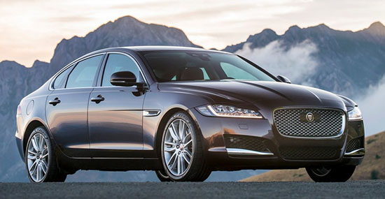
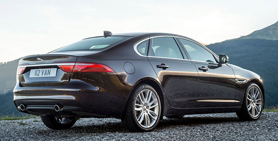
More pictures of the redesigned 2016 Jaguar XF
Actually looking better in a classier color.
(Although the profile is still more Subaru than Jaguar)
I still don’t like the interior. The lower part of the console is fine, the rest doesn’t belong in a Jaguar.
That vast, flat aluminum area covering most of the dash never looks good. In any car.
And, in a Jaguar, it should be wood.


