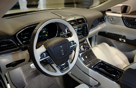
L.A Auto Show: New Lincoln Continental interior
I never liked the concept. And don’t like the production model either. At least in pictures.
In real life, it just doesn’t stand out in any way. The door handles seem to to be the only cool/original touch in an otherwise invisible design.
And the new Lincoln grille looks as awful as it looks on the revised MKZ.
(Let’s hope this doesn’t spread to their SUVs next year)
The new Continental is supposed to convey some sort of quiet, sophisticated luxury.
It does the opposite.
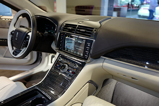
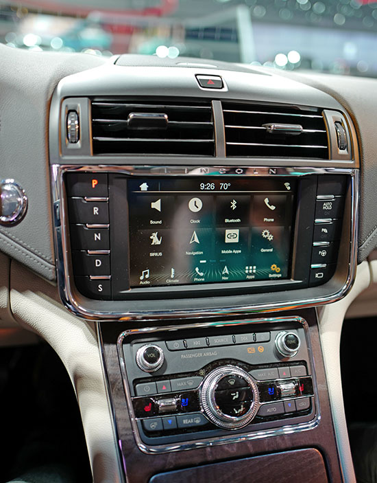
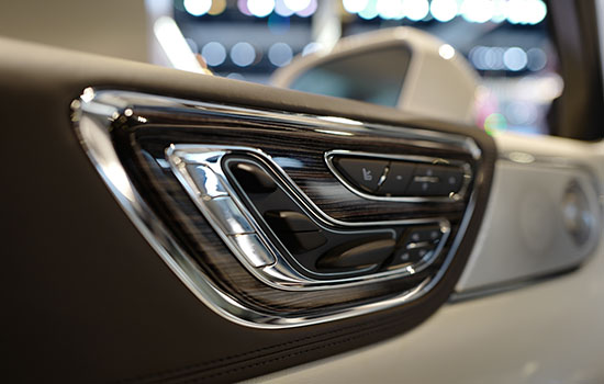
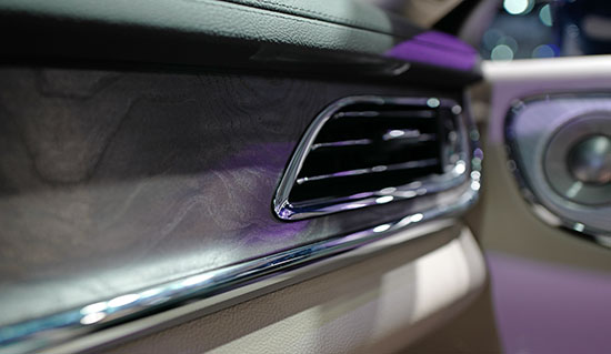
As almost every line is accented by a cheap looking plastic chrome piece. I mean it’s everywhere.
(Just look at the pictures above)
No brushed aluminum/satin finish here. Just cheap shiny plastic. And super shiny wood.
Everywhere. (But I do have to admit, the seats do look and feel great)
This is the car version of a cheap Vegas suite. (With a good mattress)
Or a place at the Trump tower.
They will tell you the car starts at $45 000. But the model I photographed was priced at $72 000.
Yes, this is the interior of a $72 000 car….

