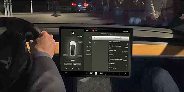
Tesla Model3, view from the cockpit.
Last Updated:
I guess this will be what you see when you drive the new Model 3 from Tesla.
I still think that big screen right in front of you is a huge distraction.
Sure, we do get used to almost everything. I just really don’t see why.
I still like a knob here and there. Especially for sound system volume.
There is just nothing here.
A hyper minimalist interior. We’ll see if people actually like it, besides the Tesla fans.
It could look cheap.
The Model S’s interior is also very modern. But I think it does look quite cheap next to other “$75 000 to $100 000” cars.
(The doors also feel pretty light weight.)
This might end up being a bit too much for most.
What do you think?
I don't see a speedo. Is there a HUD, or is the car's speed only shown in some sub-menu?
I'm waiting to see what their truck will look like, if it ever happens. If it's nice and a real truck (meaning durable, tough, can tow and go off road), and gets good distance/mileage per charge, it could be a real game changer. I'm really surprised Toyota hasn't released at least a hybrid version of the Tundra and/or Tacoma.
I completely agree with you Vince, my current lease will end in early 2019 and I thought this was going to be my next car. After seeing the interior pictures I'm really thinking it won't. This is so plain, plus I would feel like I have a TV or computer screen in front of me all the time. I really believe I'll pass….
So I can't use my phone when driving in most states but I can go through all the menus in a screen like this. I don't see the difference.
When it is in drive all you will see is D, your radio, and nav. Everything else will be blacked out.
Obnoxious.
No HUD or anything else. Just that one screen.
A really cool idea. But a very impractical one I think.
A cardboard box with an iPad and a steering wheel
It will be very interesting to see what would happen when that display stops working….