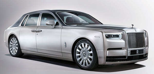
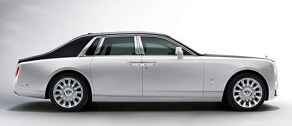
About that all new Rolls Royce Phantom…
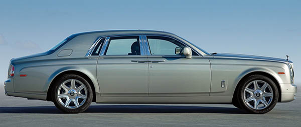
I posted a picture of the current model below the brand new one.
Since it is pretty much the only way to tell the new car apart.
The proportions are actually quite different. The new model also looks a lot simpler.
And it looks like they’ve done away with bumpers. Completely!
(Have the bumper laws completely been eliminated overnight??? Why???)
I also wonder why there is no good official picture of the car. I mean, this is the big Rolls! It’s not like England doesn’t have great photo locations for the most expensive sedan in the world.
Why release these horrible pix???
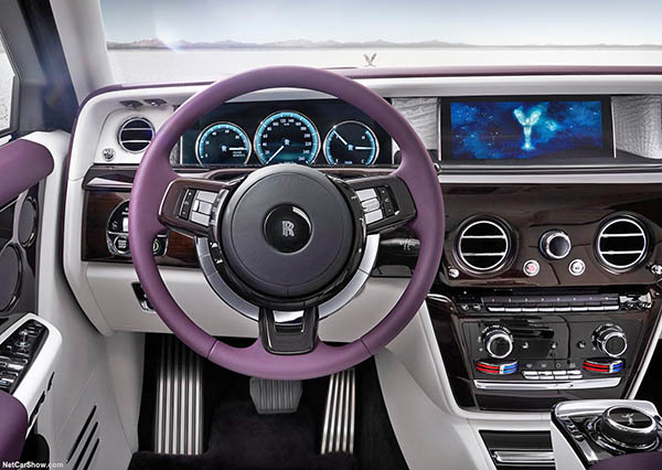
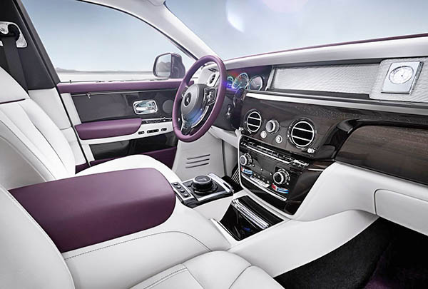
Even worse for the interior.
Why would Rolls Royce even show that horrible color combo?
This looks like a car the Joker drives. What the hell???
We are talking about one of the most expensive car in the world and the official pictures make it look like a movie prop joke!
I will try to find better pix (or not) soon.

