Honda Crider: worst Honda design ever?
Last Updated:
You could say that Honda has been in a “design rot” for a while.
A long while.
But they they are at their worst in the Chinese market.
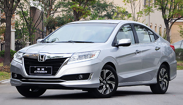
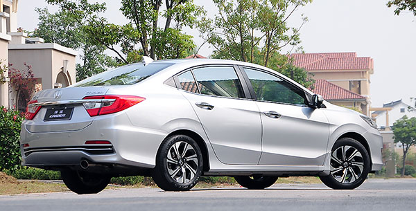
Exemple: This Honda Crider sedan.
Apparently, this China only model is based on a stretched Fit platform. But ends up in between a Civic and an Accord (Go figure…)
This is pretty much the worst looking Honda Sedan ever. The side lines, the grille, the tiny wheels.
This poor thing gets everything wrong.
Who draws these things? And who approves them???
Dear God. Let's hope the new Accord does not take any design cues from the Crider. I am surprised the Chinese market would tolerate such a design mess. Most of the Chinese designs of late are much improved over just a few years ago.
Why are Chinese models stretched? Generally speaking they are not nearly as tall.
They are the same kind of people who approved Ford Fiesta sedan, Nissan Versa sedan… People who go to work as designer without glasses.
And yet Honda is killing it in China right now. Sales through May were up 19% YTD and they're going to crest 1 million sales for the second year in a row…probably set another all-time record as well. Crider sales are down this year…but the new Civic is stealing a lot of those sales I think – which is up 244% in China YTD. Not questioning how ugly the Crider is…but clearly Honda has the product that the Chinese people want.
It's like my eyes sucked on a lemon.
Wow! Hope this Honda design group did "NOT" work on the 2018 Accord or we Accord fans will be very unhappy!
There are buyers out there who could not care less about the design opinions of our eclectic crowd in this blog. Hondas look better in person anyway.
Honda will soon start being known as the ugly car company
Inverted fender flares? That goes against the reason fender flares are designed into a car. To make the fender look more pronounced and robust. This design has the opposite effect. Trying too hard and screwing things up.
Hey foolish Honda salesperson, a good looking car looks great in pics and in person. Weak excuse for sure. Lol. Soooo ugly
"Hey foolish Honda salesperson,"
You are projecting again lightbulb.
It's not worse than our Civic, by the way…
This car actually combines basically all design trends (bar a fake exhaust) that are wrong today. I just always wonder which designer had a look at this (or many other of these horrid overdone wrongly proportioned designs) and thought "yes this is teh best we can do"…
Special credit goes to Honda when you consider how well proportioned and not over done in detailing department their cars were basically all the way form the late 80ies to the early/mid 00ies….
Worst front end, ever bar none.
Probably their worst front end design ever, bar none.