2020 Kia Soul
Last Updated:
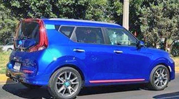
Well… That looks a bit weird to me.
The rear bumper with fake vents on the sides seems pretty heavy looking. And the rear lights are just getting quite strange this time around.
And a bit too curvy for the rest of the car.
It now has more of a Chinese design feel to it. I guess this is the way everything will go in the next few years.
In order to please the world’s largest car market…
More on the new Soul very soon, including much better pictures.
(Thanks to a reader for sending me these)
It looks pretty damn original and funky. Love the taillight treatment.
Oops….bummer… looks like they are wrecking a good thing. The treatmemt the fender/wheel cut-outs, and of the whole rear, including bumper, tail lights and D-Pillar, shows lack of restraint and poor syncronization of design efforts… maybe another design director who was unable to say "no" to any contribution, having, therefore, to accommodate many disparate elements into one mess.
I believe some of this can be fixed with some matte black trim on the wheel cut-outs and selectively placed on the rear bumper, just to reduce the visual impact of the overly complex surface treatments.
One annoying choice that will be less apparent with production completion (having all the black trim where it is supposed to be) is the fact the rear edge of the 3rd window is following the door angle instead of the tail light angle.
There is a simple design test, during form development that maybe has been forgotten on many brands… What does the form look like in all white, with no color variations? This test will reveal incongruent and unresolved features of the form.
The rear of this will be complete redesigned within 2 years after sales tank.
That back end's a complete mess and total disaster. The rest is okay, but every square centimeter behind the rear wheels needs a rework.
Agree with Df on the quarter window/taillight treatment, will probably look better when that black plastic connector isnt covered but the whole thing is just off somehow. I very much dislike the Priusization of the taillights, leaving the body-color window piece floating incongruently. The front doesn't bother me as much, but it's getting weird that Kia and Hyundai seem to be carrying the trendy design elements across the brands. Will probably look better to me in person, but the purity of the first two generations has been lost.
Do we even know for sure this is the final design, or even the USA market version?
How can we know for sure that these pictures aren't showing some sort of Chinese knock-off of the Soul?
(They are notorious for doing this all the time!)
I suggest everyone take a deep breath before starting to criticize the "new" Kia Soul being shown in these photos.
It's really premature at this point.
This looks like the Chinese version. Cyan C pillar trim? Sci-fi taillights that clearly do not align to the live bulbs? *fingers crossed*
The front end is a copy of the original Cherokee KL, the taillight design resembles the Toyota Prius, and the side view is derivative of 99.9% of the crossovers out there. Was anyone at Kia even trying, because the “new” Soul doesn’t have any soul. Maybe it is a Chinese knockoff.
Wow! There is so much interest in this econobox! Who cares about these details people? It is still a box on wheels. And a pretty practical one, I may add….
Ok.
Here's my biggest problem with cars like these is that car companies don't see the D-pillar as an opportunity to increase outward visibility. There is no reason to have such a compromise between styling and practically, especially in this case. It's rather ugly…
Oh yeah, Kia wrecked it big time! Yikes!
Looks like they are trying to copy Honda with the hideous taillight treatment.
I own and love my '17 Soul+.
Would I consider this as a replacement? Yep. Would I probably prefer a Kona? Yes indeed. Do I wish Kia would sell the Stonic here? Absolutely.
Not a stopper, but it looks a lot less clean than the previous two generations.
Auto show pictures and videos look better.
I liked the rear styling and overall shape of the first gen version and the front end styling of the second gen version. If Kia would have meshed and modernized these elements, then it would have created a vehicle that would have appealed to me. This unholy mess of a third gen vehicle is completely unattractive. The side window shape, faux floating roof, and awkward taillight execution totally ruin this new gen version for me. The additions and overdone details on the exterior simply don’t gel or work. To me, the Soul has one of those unique and iconic designs that just needed to be updated and modernized when new generations were introduced. While Kia didn’t attempt to completely redefine the exterior design of this vehicle, it did stray far enough off the path to definitely undermine the wonderful simplicity and appeal of the initial design. Total fail on this one, Kia! 🙁👎🏻