2022 Kia Sportage: new illustrations…
Last Updated:
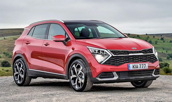
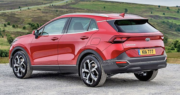
These new illustrations give us another idea of what the all-new 2022 Kia Sportage might look like. And again, not the prettiest thing.
I think the blunt plasticky front end is just going too far. And basically is reaching very deep into the “land of ugly”.
I really hope the real thing ends up quite different. Since the front end is still mostly covered on all the prototypes driving around, there is still hope…
I like it better than the Tuscon for the rounded wheel arches alone.
Remove the middle bar and make the tiger fit the whole grille might make it better. This is someone trying to merge a Seltos with an Optima.
Messy, but better. Not sure why there is a double tiger grille though.
That chrome band in the back bothers me more than the grill. It ends nowhere.
someone should be fired for that front end
'' Beauty is in the Eye of the beer holder ''. 🙂
ok, i like like it. And i'm not even drinking beer . I've had a tiny bit of edibles, lol, but my judgement is not impaired at all. I just think it looks very nice, a bit aggressive, i'd be happy with it.
Anywho…..i should go feed the unicorns. 🙂
Ditto, for firing the inspiration behind the front end….
Good looking outside, but what about inside?
Agree, think it is trying to link with Optima styling, or the European Stonic.