2021 Citroen C3 Aircross: the horror…

Last Updated:

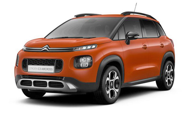
After about 4 years, Citroen decided to refresh the tiny C3 Aircross SUV. And the result is just plain bad. 
While the original design wasn’t the best looking thing, it had a cute, rounded personality. Kind of like a little Bulldog. 
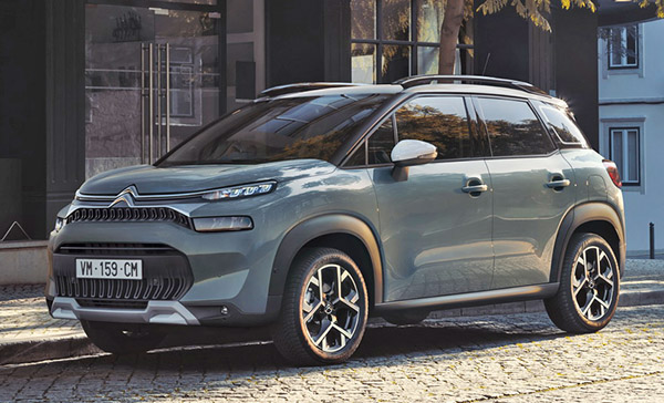
The new front end is just a visual nightmare. An example of “what NOT to do”. Also, of course, adding very straight lines to a very rounded design. The original bad idea.
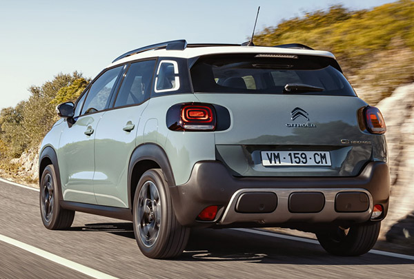
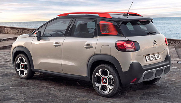
The designers were so busy ruining the front end, it seems they ran out of time to disfigure the rear of the car. So it’s only disturbingly ugly if you see it coming. Going away is still OK.

 

Conversation 5 comments

  1. COuldn't agree more; In all honesty, I will not understand why nowadays, even the smallest car (that should be cute) has to look super aggressive, with a mean look and air intakes like a military jet.

  2. the upgrade is more a retrograde. the red car is far better looking and a more cohesive design. The light blue/grey car has a strange combination of lines, vertical bars shovel nose.. why all that complexity for such a terrible whole? The minuscule "fog lights" in the chin spoiler are terrible. What's the point for these, how much light can they actually put on the road?

    One positive, the bottom cream car with red highlights… I do like the whimsical look of the rear window with the stuck on red blinds. It's such a great little design and so much better than the boring white, red and a sea of different greys.

Leave a comment

Your email address will not be published. Required fields are marked *