2022 Honda HR-V: already more pix…

Last Updated:

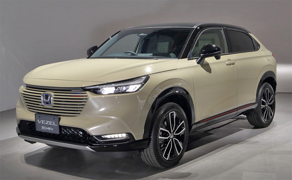
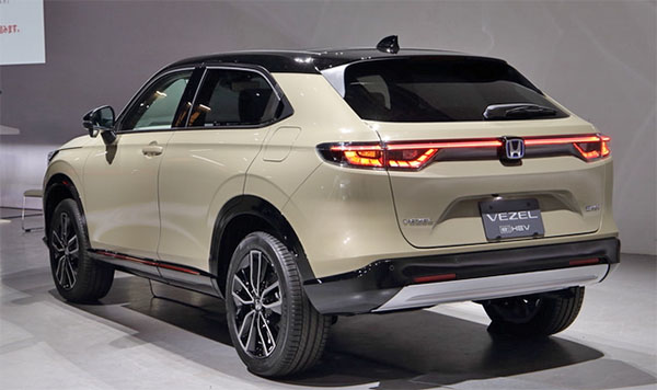
Here are more pix of the all-new 2022 Honda HR-V. Live! (from somewhere)

They picked some weird color. Not really beige, not really yellow. Why not. At least it’s kinda new.

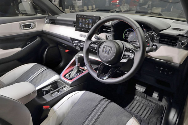
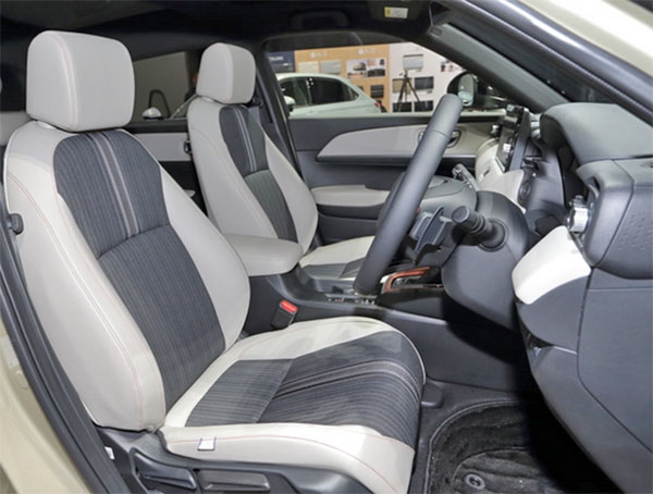
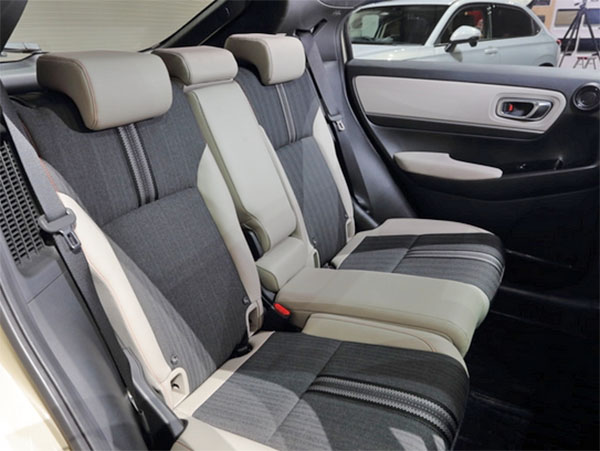
I like the 2 tone interior. The “less leather” trend is great. But that dashboard seems awfully busy. At least from that angle. I mean, stuff everywhere. Plus that red console trim is pretty horrible. I guess it’s supposed to match the red line outside (that’s code for “sporty”). 

Not really sold on this yet. To me, simpler is better. But the exterior, although simpler and cleaner, seems to be another amalgam of things we have seen everywhere before. And that busy dash… 

I don’t know…
 

Conversation 11 comments

  1. I think both exterior and interior look great. I agree with you about the red console trim and I hope that changes. But aside from that, this car follows the accord infotainment design and I really appreciate that.

  2. I can't really complain with this new model. I know the reddish/orange trim around the shifter doesn't appeal to most tastes, but it's an attempt to show off it's sporty off road style. We've seen this in the off road version of the RAV4. There are some other neat touches and "advance features" we won't see on our lame HR-V version. Sunroof and fancy LED bits will be the Walmart version.

  3. Simple and clean. Not so original but it is a new wind of simplicity in the Honda design that will invest all future models. I like it and I hoped so

  4. That red console looks like something a boy racer would do to his own car. That looks ridiculous. I just hope Honda doesn't go crazy with the red in the Civic Si and Type R like they did the 2020. I can almost guarantee they will though. I would rather see ambient lighting take it's place.

  5. That puke green colour is very fitting for this poor escuse for a modern car.

    Those seats remind me of my econobox Suzuki Swift first car back in the 90's.

    Honda can't design anything well these days.

  6. Talk about absolute ridiculous that design is horrendous. it's as if Honda is trying to do something different and they don't really know what it is.

    Let's just hope this is not their new design theme for the upcoming CRV and Accord. at least the current models have an overall nice design and flow where these images look like something that are just nondescript and definitely will not age well.

Leave a comment

Your email address will not be published. Required fields are marked *