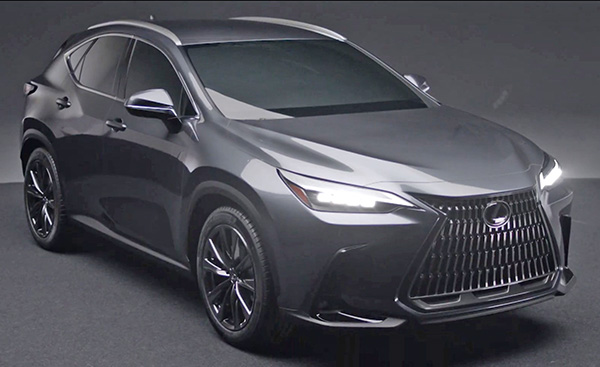
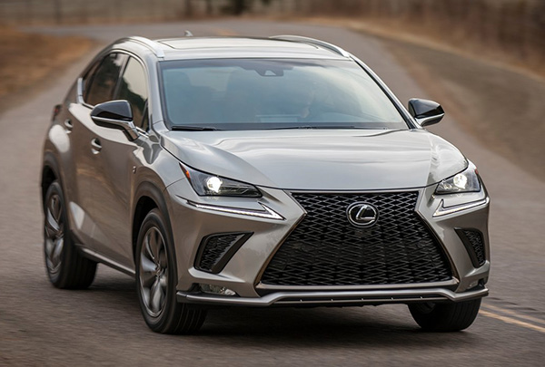
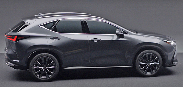
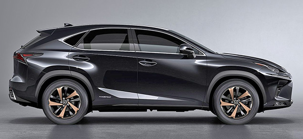
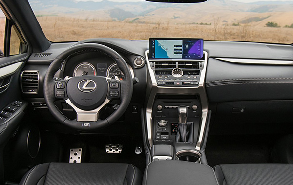
2022 Lexus NX: next to the current one…
Last Updated:
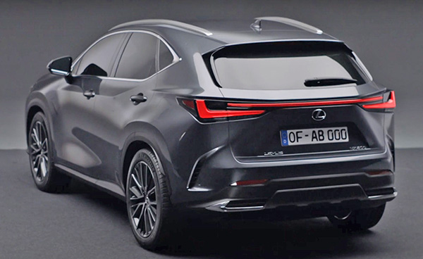
I hate to say, but this new 2022 Lexus NX is another disappointment. At least do far…
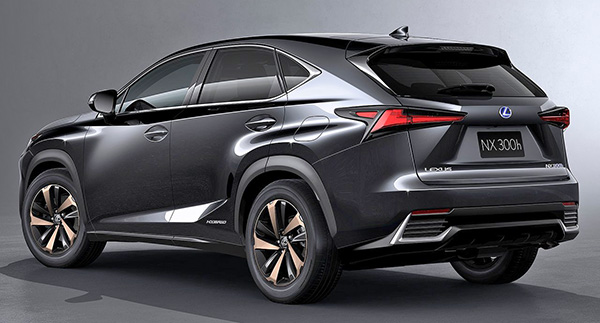
As you can see, the design is cleaned up a bit. But not that much. It is less angular for sure. Looking like a slightly melted version of the current car. (Putting an old clay model in a microwave for 90 seconds should never replace real design work)
But there are still plenty of fake scoops front and rear. Unnecessary lines etc…
On top of that, it looks a lot like the Toyota Venza. Even more than before!
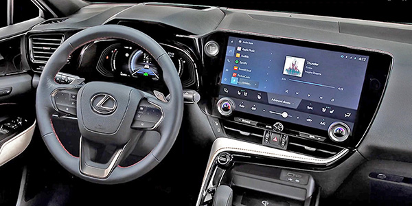
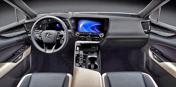
Inside it now looks like the Toyota Mirai!
Why???
It seems Lexus is doing its best to remind people they are luxury versions of their Toyota models. Again, why????
And the passenger side of the dash looks like it was not designed at all. (The design department must have had to leave early that day)
I really want to like Lexus, but this seems like a busy yet uninspired mess.
They still sold over 58 000 of these in 2019. Which isn’t bad. But the new one will now have to compete with the all-new Genesis GV70. Yes, it’s another world now…
From what I see here, it’ll be a tough fight for Lexus.
Vince, I’d love to see what you would come up with if you designed a modern car. You instantly complain about every car, big grilles, screen on the dash. Should they go back to wire wheel covers and fake wood panelling for you?
I like it a lot for a small SUV. I hope its handling has improved..
Agree, that design is pretty bland for Lexus. Getting rid of knobs & buttons and replacing them with touch capacitive areas similar to Venza isn't a great experience and not really an improvement.
Acura MDX/TLX might be overly busy but I think they did a better job retaining the functionality of A/C buttons and placing screen bit higher.
Mirai was what the final Lexus GS proposal was, hence similarities to new NX.
I think it’s a good evolution of the current NX. The only similarity I see to the Venda is the C pillar 3rd side window kink. The interior is a big improvement. Looks a bit like the mirai interior sadly. Still nicer than current and the touchpad looks to be banished, yeah.
Vince we are opposites, I hate the Ioniq 5, but love this! Lol
I definitely think the new NX is overall good looking… but it overall seems like a refresh. My initial reaction was good but now seeing it next to the current gen it’s more of an ehh… Definitely along the lines of what we also saw with the new C-class. It’s like they literally moved around some of the lines and smoothed some things out. But I think the overall interior is a borderline fail… the passenger side dash is just… there. Not even any stitching that is on trend these days. I honestly feel the new Rogues and CX-5 interiors are nicer. Even the current gen looks more upscale and thought. Not sure what they were thinking there…
I really do feel like the design direction of Toyota/Lexus has been really playing it close for the last 5 or so years, yet it seems to go unmentioned by most. But I guess that’s what their good reliability reputation has afforded them.
Glad they got rid of the nike swoosh. It was a silly design element that looks very cheap. The grille is still a nightmare and the interior is a mess. But Lexus owners don't care because they think they're buying a luxury car.