Revised Tesla Model 3 interior: more pix…

Last Updated:


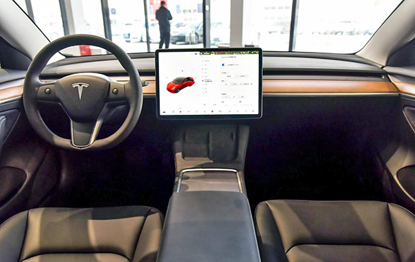
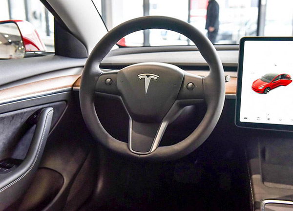
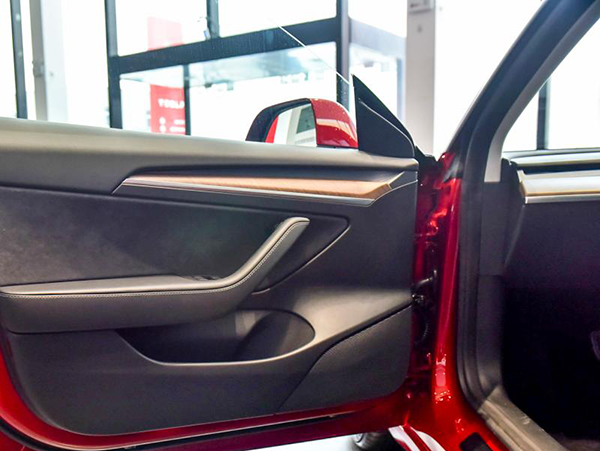
It seems Tesla is trying to warm up all their interiors by adding more wood trim. The new S and X have tons of it now. And the 3 and Y have been updated for the Chinese market with… more wood trim!
I personally think it looks just fine. And might actually do the job of warming up the rather sterile environment in the Model 3 and Y. 
I wish Tesla would add more colors. Inside and out. Especially now we get to see all these wonderful colors Ford is offering on the Bronco and Bronco Sport.
 Let’s hope that get people into fun colors again…

Conversation 10 comments

  1. Vince said: Especially now we get to see all these wonderful colors Ford is offering on the Bronco and Bronco Sport.

    Only the seats vary slightly. Everything else is still all black.
    What do you mean?

  2. These Tesla interiors look like the clay mockups of an interior waiting to be finished. So plain and dull.

  3. Has no one dug to find out why there's no color choices offered – I mean other then myself of course.
    PPG moved their German pigment factory to Japan – immediately prior the Fukushima quake and well within their exclusion zone, it's been more than ten yrs. and they still haven't ramped up production in Germany – BTW: All the Car companies use the same paint colors they have a set number to choose from (other then Dodge lol) the Companies "Usually" only rename the colors but the formulations are precisely the same.
    Should you or any others do any research i did mine nearly six yrs. ago now, maybe things have changed, after all they build Chevrolet's in China now.

  4. Doesn't work for me, as it's the one interior design element that will never get my attention or dollars. If Tesla really wants to improve the Model 3 and Y, then they should add a seperate driver's instrument binnacle similar to the Model S.

  5. The crappy boring interior is the one and only reason I didn't get a 3. I hate it with a passion and still do.

  6. The reason that this looks so "sterile" is because of the lack of instruments in front of the driver. It's something that works just fine for me in the Z8, and it's completely stupid that people whine endlessly about it with the 3. Plus, the complete absence of air vents. Which are massively ugly in most cars but we are used to them and look past them completely. Then don't realize they're gone in the 3, just that there's a lot less going on with the design of the dashboard. The air vents in the 3/Y and now in the S/X are the most brilliant things I've seen in a car interior in a long while.

    Also, the news releases about the 3 and Y update are more than a month old, and the updates are available on the US versions of the 3. The upgrades to the 3 are chrome delete, new wheel design, larger battery pack, heated steering wheel, center console update, wireless charging, updated door switchgear graphics, updated headlamps, revised door cards, heat pump for the thermal management of the battery and interior climate, slightly smaller front trunk, double pane front door glass, power trunk, and the addition of USB-C. I'm sure I missed something.

  7. I love it. I had a Model S and went to a 3; my biggest concern was the lack of instruments; I won't look back. It gives you such a commanding view of the road and is so clean.

  8. If this was an 1980s interior concept, people would think it was cool. Now it looks really sterile, cheap and boring. That tablet looks like it should be hanging behind the register at McDonalds. Ridiculous that no one can incorporate a simple rectangle into their cars dashboards.

Leave a comment

Your email address will not be published. Required fields are marked *