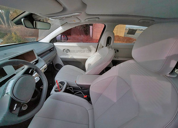
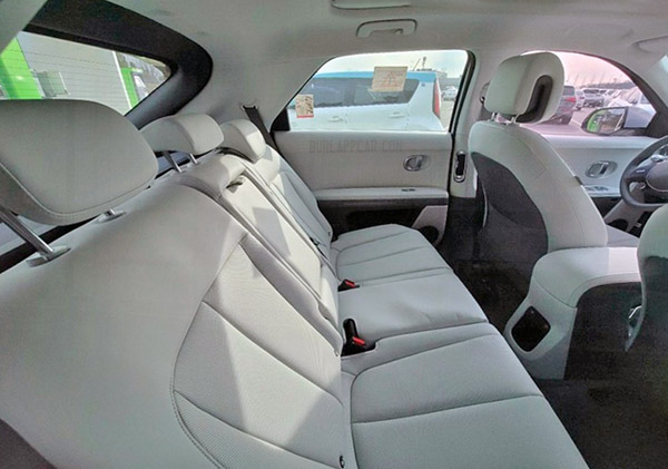
2022 Hyundai Ioniq5: a non official look inside
Last Updated:
These look really distorted. Probably from a GoPro camera (or something???)
But it does show how nice the interior, still.
The only thing that seems weird is the white frame for the screens. I’ve actually never seen that before on any other car. It’s usually dark. Like all the screens we are used to (TV, phone, etc..)
When the screens are off or on a darker mode, it does look a bit strange.
A large, darker rectangle with both screens integrated seems cleaner.
Who knows…
The colors are so monocromatic that it loses any sense of style and that front console eats up way too much room in the back seat.
The screens will apparently have white backgrounds (see 23 Feb post) to integrate with the white dash. Maybe dark interiors get black backgrounds?
The original Volt had a white dash.
I think it's great design and I can't wait to see it in person.
That steering wheel is really ugly imo.
Looks ok, I prefer the Mach E although the 350 kW charging speeds of the Ioniq 5 are more attractive. Don't like the thick bezels around the displays.
It looks so comfortable inside, especially up front. I just hope it doesn't have any blind spot or bugged by squeaks and rattles.
There might be a delay at the factory caused by union employees and chip shortages and I bet dealers will be asking above MSRP.
Vince, I can't agree. I think this looks incredibly cheap all around.
New video US Spec version: https://www.youtube.com/watch?v=mTY5jOBOLpk
A clean and spacious interior fit for the 21st century. I think the screen surrounds are actually a brush metallic look. I do wonder if the white background of the screens has a "dark mode", especially for night driving.
Hyundai going for home like interior hence the white theme dash, look at Google home devices. Personally, I'm intrigued, nothing is stopping full autonomous vehicles, cars will be the extension of our homes.