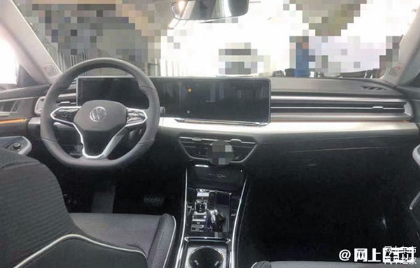
New VW Lamando: a look inside…
I recently posted photos of the redesigned VW Lamando for the Chinese market (HERE)
Today we get to see the interior. Which follows the current trend. Such a trend that it seems everyone is designing the same dashboards these days. A basic dash with horizontal vents and some widescreen on top of it. It was quite original when Mercedes introduced this look (although with round vents) on the E-Class about 4 years ago. But it is becoming the default look for almost everything these days. (Mercedes has since moved on with vertical screens sticking out of the console.)
I guess these plastic screens are getting so cheap to produce they are replacing everything.
Does anyone here miss real gauges?

