2023 Honda Accord Interior: Vs. other Hondas…


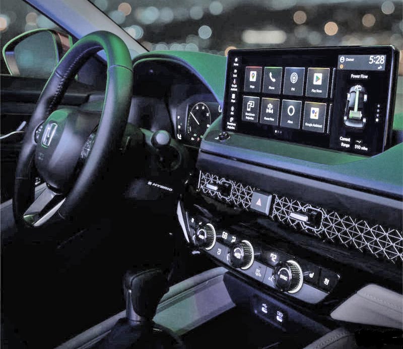
I just found a better photo of the new 2023 Honda Accord interior, showing a bit more. And posted other current Honda interior shots to compare. Read on if you dare. It’s a little bit sad…
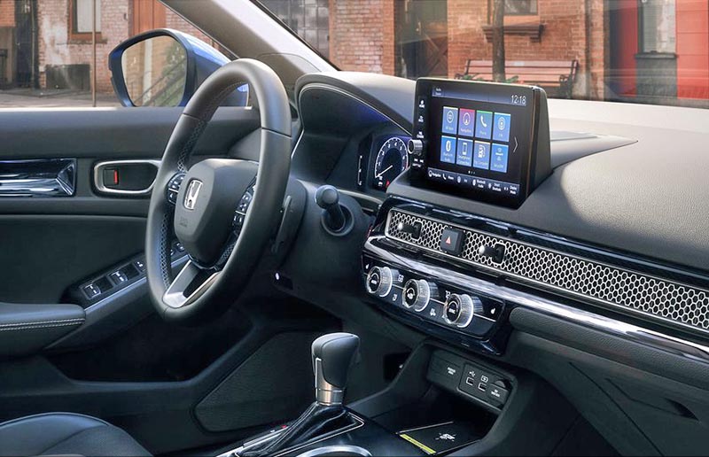
First, the one that started it all, the 2022 Civic. The new Accord interior seems shockingly close to the smaller and cheaper Civic interior. Same general layout. Exact same switch gear and steering wheel. So far, the larger screen seems to be the only difference.
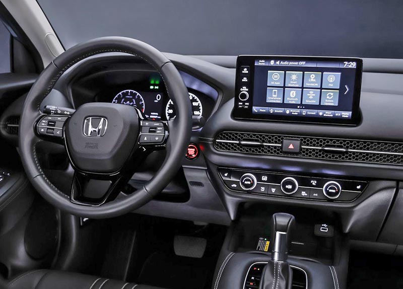
Then we have the HR-V, which is just a more rounded, softer version of the Civic. But again, everything else seems the same.
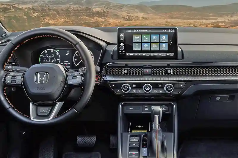
Finally, the new 2023 CR-V. With its own wider console, but basically the same dashboard and exact same controls and steering wheel.
I really think this is very disappointing for the Accord. And Honda in general. Designing basically the exact same interior for at least 4 of your models (I am not holding my breath about the new Pilot interior) is just lazy and cheap. This is cheapness everyone can see. All these cars on dealer floors with all the same interiors. I guess the closest thing to this is the current Mercedes models. So Honda isn’t the only one.
I guess most people don’t care?
