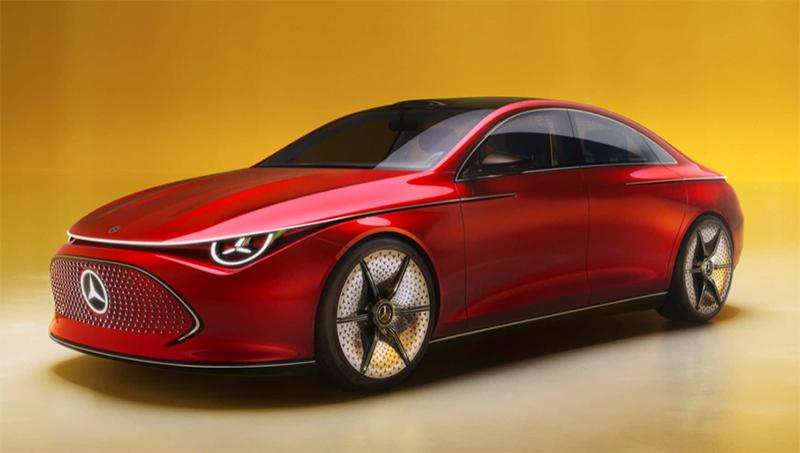
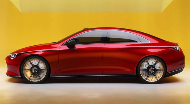
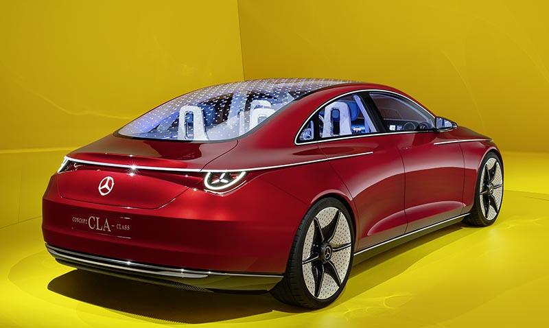
Mercedes Concept CLA-Class
The name of this new concept is a bit misleading since there has been a CLA for years. This is hardly a “new class” for Mercedes.
I didn’t realize, but the current CLA is already about 5 years old. This means it could be time for a new one in a year or so. This new concept is probably a very close preview of the 3rd generation CLA, now turning into an EV only model.
It is an EV based on an all-new platform called MMA and will come with a choice of 2 batteries, with a range of up to 466 miles in the very optimisitc European test cycle.
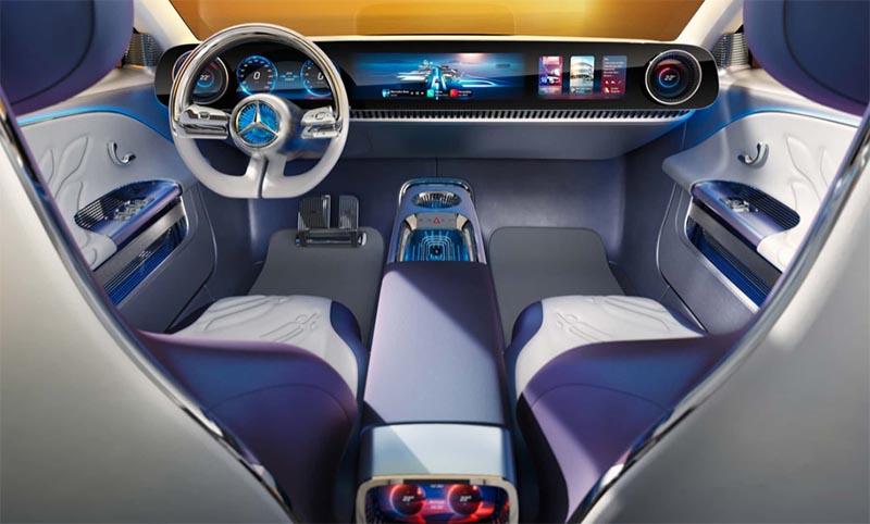
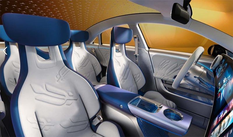
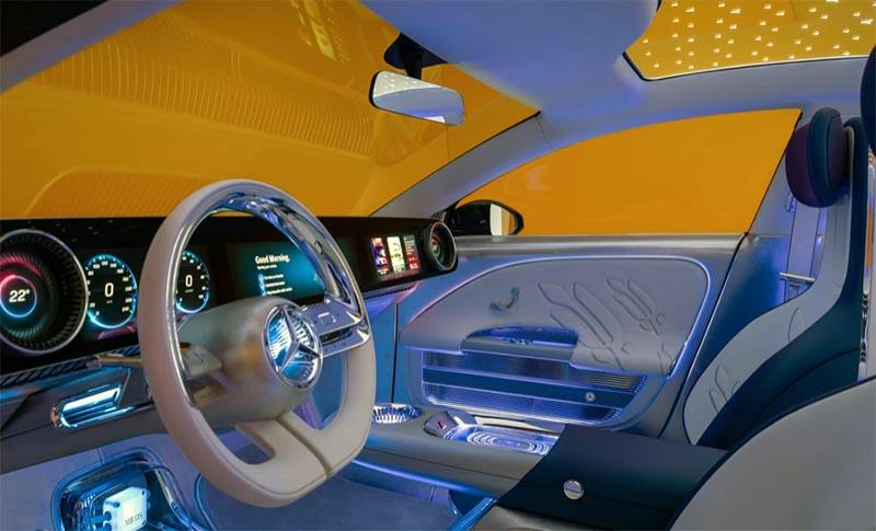
The interior is hard to describe except by the words” too much”. I am sure the main shapes of everything might make it into the production model, but the ghastly LED light show and weird trims and textures will hopefully not.
I think the design looks very nice, except the miriad of Mercedes logos everywhere, which is becoming extremely obnoxious.
The new front end already looks much nicer than their current “EQ” models. This could end up being a very atractive compact EV sedan when it comes out. And quite a competition for the new Tesla Model 3. I also think it will make all current “EQ” models look really old.
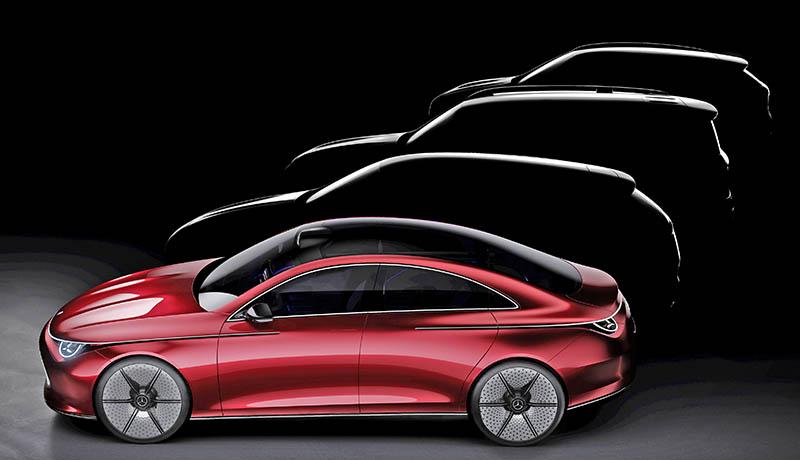
Mercedes has big plans for the new platform and the bottom pic shows what’s coming next: a wagon and 2 SUVs. The 3rd one looking a lot like a replacement fot the EQB…