2019 BMW 7 series
Last Updated:
This facelift for 2019 is probably the worst thing that ever happened to the BMW 7 series.
(2019 model on top)
The giant clowny grille, the extra chrome. It is really hard to understand.
Unless BMW is just designing their cars for the Chinese market now. Where overdone, over-chromed designs are popular.
The rear is fine. (2019 model on top)
Except for “even more chrome”. Of course…
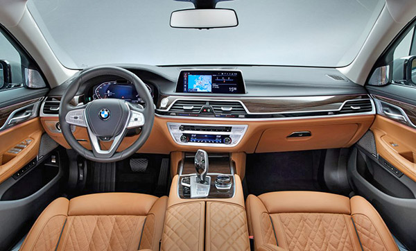
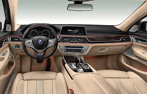
Nothing to report inside (2019 model on top)
Except for the new digital instruments. And of course, more satin chrome on the steering wheel.
It looks like BMW has basically ruined the 7 series by adding the giant grille from the X7 to it.
Which is really too bad.
This is great news for Mercedes and their upcoming all-new S-Class sedan.
Good news also for the new Audi A8. Which now looks pretty restrained.
And I would say, also good news to everyone else who is going for the big luxury sedan market.
Like Genesis and Kia. (although I am aware that any brand snob looking at a 7 series won’t even consider anything that isn’t from Germany…)

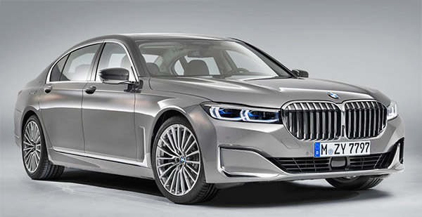
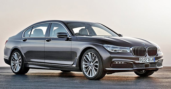
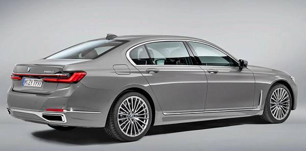
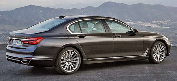
This is a great illustration of how certain minor details can ruin an overall shape. The grille and oversized headlights are hideous for sure, but for me the worst design detail is the new fake front fender vents. The previous model vents sort of angled forward and gave the car a feeling of forward motion, while emphasizing the wheelbase length.. the new one takes a semi-rounded curve and goes nearly vertical, both of which resemble Rolls Royce cues and gives the impression of standing still or even leaning backwards. Not dynamic at all.
The front end looks like a Kenworth truck!
I've been following this vehicle for a while.
As an owner of a current generation 7-Series, I think this is an improvement.
The current 7 looks fairly elegant and sporty. But it also looks demure and small next to an S-Class, an LS500, or even the new A8 with its FWD proportions.
A car of this caliber needs to look imposing and stalwart, even if it does bend towards the sporty side of the spectrum, like the 7-Series. It still has to play in that sandbox. The previous F02 generation of the 7-Series was a little better at this.
Rolls-Royce is the absolute king of this, so it's no surprise BMW looked to their upmarket brothers to take design cues that embody that imperious sense of superiority. Naturally, the 7 isn't as large as the Phantom, so it can't match it in every way. But a tall blunt end rolling slowly towards you and coming to a stop as someone gets out, signals wealth and power more than the current design language.
It might not look great but nothing was worse than the Bangle butt.
I do not know what is wrong with me, but I like it more than the current one. Plus, remember, real estate brokers need to update their ride.
I hope the bow of the dash looks better in person.
Put some black paint on the grille slats and it'll look less clowny, and the flimsy lower grille ruins an otherwise nice bumper design.
The new front end says “Bow down before me pathetic 99%ers.” As it should. But why is BMW abandoning their brilliant mirror image front license plates?
I like the new refresh styling of the 7 series!