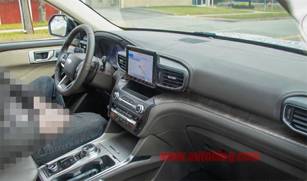
2020 Ford Explorer interior
Last Updated:
Here is the first picture of the all-new 2020 Ford Explorer interior.
The tablet from the Aviator is still there, but its integration to the dashboard design seems to be about 12% better.
The way the fake wood on the dash meets the top of the consloe seems a bit weird.
Otherwise, it does look a bit trucky. More like a Chevrolet Tahoe than a car based Crossover.
Why not…
Head over HERE for more pictures.


The screen placement is just bizarre and the interior pales in comparison to the Aviator. The more I look at this photo, the more the screen placement reminds me of the Tesla Model 3's giant screen.
I hope there's more to this because this is a drastic step back in design compared to thhe current model. This almost looks like it's from the 90's
Why is that guy pixelated and what is he doing?
Another shifter gone….yes!!!
Why do you always complain about the same things- Cars don't have too much chrome, and the displays don't look like tablets. Stop acting like you are 100 years old and start understanding the industry trends. As a journalist you should be unbiased, yet it is evident your opinions on every post. Losing my interest and many others based on my conversations.
Wow, that looks incredibly dated. And the "tablet" still looks like something you could pull off the dash without the least bit of trouble. I've had an Explorer in the past and liked it, but this leaves me cold.
The interior is shaping as nicely as the exterior. As for the infotainment display, it actually looks better than most (and keep in mind this is a pre-production test vehicle) and certainly no worse than the new Mazda 3’s “tablet in a hole” look.
Why can’t Ford integrate the screen into the center stack like that of S Class?
better than the Land Rover you posted above this Ford.
The screen is fine. Why surround it with plastic? All that will do is give
a heavier feel to interior by making the dash much more bulkier.
It' placement is a good compromise for both the driver and the passenger. Short of giving each their own display, I think it's fine.
top part of dash looks a lot like Kia Sorento influence.
Because, 1) S-Class is $100K and 2) if they did 99% of the people that make replies like they stole etc!!!