2019 Toyota Avalon
Last Updated:
I don’t know…
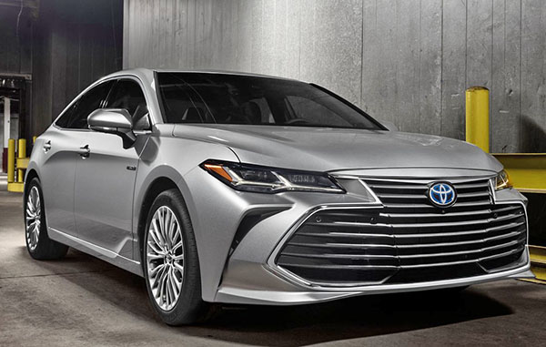
At first I thought these were pictures of the Camry.
It does look a lot like the new Camry. A bit too much.
And that giant mouth. Now the whole front end is the grille. Except for the lights.
At a time where we don’t even need them. This looks quite horrible.
Otherwise, still a lot of unnecessary lines everywhere. Not a good idea for an upscale sedan.
I actually think the current one is much more pleasant to the eyes.
This might age pretty quickly.
It suffers from that “Weird Japanese design disease”. (WJDD) Toyota and Honda are mainly affected by it.
It happens when they are criticized over and over for being “boring”. Their answer is then, always (For those affected by the disease) an overly aggressive design, tons of lines, scoops and spoilers. Weird side creases etc…
Basically, they then design what we technically call “a mess”.
This is what has happened to Toyota/Lexus and Honda/Acura for years now….
And I see no cure in sight…
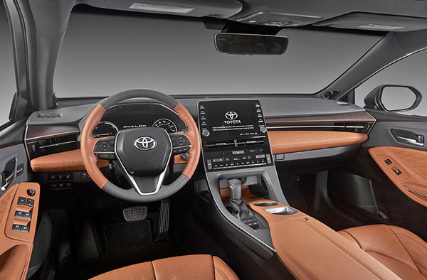
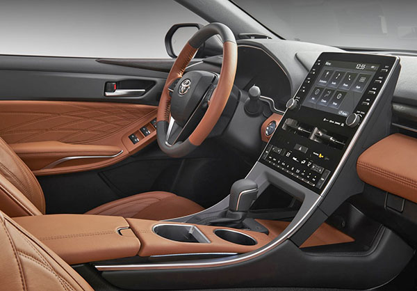
Things look much better inside the new Avalon. I think that console design is great.
But I also thing whoever thought of that orange color combo should be fired.


Well that's certainly ugly.
I never liked the current Avalon, but this is truly horrible. The exterior is just weird, with a lot of unnecessary lines, and that INTERIOR!! WTF. The center stack looks like it came out of the 80's with all those gray square buttons, and the dash is just a nightmare.
Toyota and Honda are really going through a design meltdown.
Yeah that front is horrendous….the rest of the car is alright though
I love this new design language. The rear looks fantastic. Much more aggressive than the previous one.
I think the current gen is still quite attractive. This next gen version is simply a hot mess! That new front end is hopelessly hideous!
Is it just me or does the back bumper seem to be especially pronounced in jutting out from the rest of the car as compared to most other modern car designs
The new Avalon has more grill than McDonald's
Good lord, that's horrific!
That is the worst front end in the industry right now. Pure garbage. How did they come up with that shape?? And 90% of it is fake and blocked off!!
The old model looks leagues better than this. What a shame..
The interior is also a mix of cheap-looking and weird. Terrible color combo. Stitching on the door is totally at odds with the other stylistic pieces of the interior. Console looks plasticy.
There is really nothing about this car that I like.
Horrible front end. Please kill it with fire.
Too bad, the rest looks great.
that grille looks like pennywise opening his mouth to feed on children from within the sewers.